Driving Retention & Conversion for the SKIMS App at a Global Scale
SKIMS has built its brand on redefining the standard—transforming
shapewear from something hidden into something empowering. As the
company expanded into new categories and global markets, the
digital experience needed to evolve alongside the brand.
The SKIMS mobile app serves its highest-intent and most loyal
customers, acting as both a commerce engine and a bridge between
digital and retail. My primary strategic focus areas were
personalization, conversion optimization, omnichannel expansion,
and long-term retention.
ROLE
As the sole Product Designer for the mobile app, I lead
end-to-end product design and strategy for the most retentive
segment, partnering closely with Product, Engineering, Digital
Merchandising, Creative, and Retail to scale the app alongside
rapid brand expansion. The key themes I prioritized are:
- Driving conversion through search and discovery
-
Scaling personalization and retention on the app,
specifically at the earliest touch points like Homepage
-
Building a reusable design foundation for rapid prototyping,
iteration, and handoff
-
Bridging digital and retail experiences through omni-channel
integration and loyalty membership ideation
-
Integrating AI into the app experience with virtual styling,
image search, and product review summaries
RESULTS
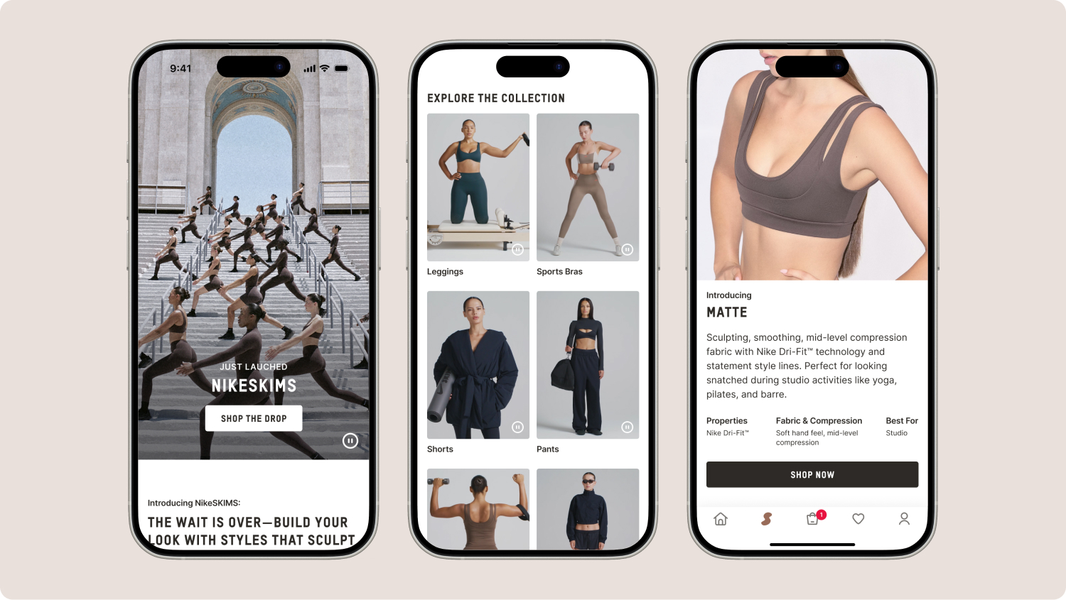
- Launched the sub-brand of NikeSKIMS on the mobile app
- Launched the app in 25+ international markets
- Increased search usage by 137%
DURATION
December 2025 - Present
SKILLS
Product Strategy
Product Design
Design Systems
Generative AI
A/B Testing
Developer Handoff
QA / UAT
User research
APP RESKIN
An elevated, editorial look and feel
As part of the app reskin, I reimagined the SKIMS mobile experience
to feel modern, immersive, and on-par with high-fashion and
performance leaders. The goal was to elevate brand perception while
also improving product discovery and conversion. Some key flows
include:
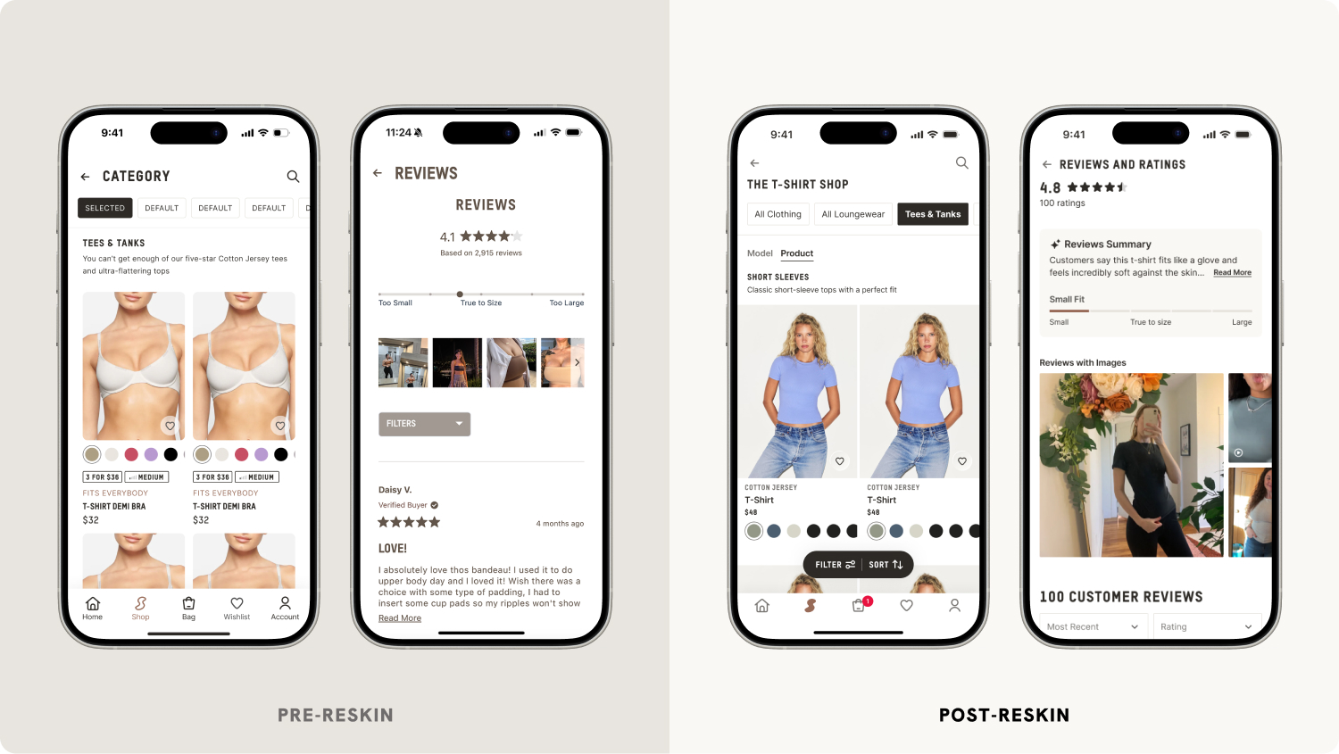
The Product List Page (PLP)
-
Full-bleed, imagery-forward product cards to create a more
immersive browsing experience
-
Swipeable product imagery on product cards, allowing users to
preview multiple views from the PLP
-
Swipeable category carousels to visually navigate through
collections
View the
prototype.
The Native Reviews Page
-
Transformed a clunky web view that accounted for the majority of
rage clicks on the app into a streamlined page with AI review
summaries, fit indicators, image galleries, video functionality,
and sort and filter options for each review
-
Designed a reviews preview sheet on the PDP with the top 3
reviews, a fit indicator, and a summarized overview with common
review themes
View the
prototype.
category expansion and sub-brand launch
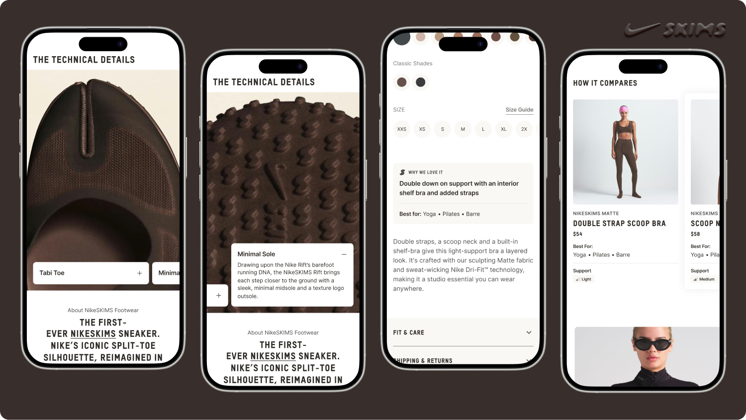
Launching NikeSKIMS
Expanding into performance activewear introduced the new challenge
of credibility. To establish trust in this new category, I designed
components that focused on product education. This supports both
high-intent shoppers and casual browsers by allowing them to
immediately understand
why a product is valuable and where it fits into their
lifestyle.
Technical fabrication at the forefront A
Technical Details section surfaces fabrication and performance
attributes upfront, allowing users to swipe and expand the cards for
more product education. The Highlights Card distills key benefits
and best-use scenarios for NikeSKIMS products in a scannable,
visually-distinguishable card on the PDP.
View the
prototype.
Comparing similar styles NikeSKIMS launched
with five new proprietary fabrics and multiple silhouettes, however,
without clear differentiation, customers risked confusion and
decision paralysis. The Comparison Cards allowed customers to
evaluate similar styles side-by-side, comparing support levels and
best-use cases (low-impact Pilates vs. high-impact running).
Landing pages on the SKIMS app To support
the NikeSKIMS launch, I designed a dedicated in-app landing page to
provide both fabric education and visual storytelling. By
centralizing education, inspiration, and technical detail in one
immersive destination, the landing page positioned NikeSKIMS as a
distinct performance sub-brand with its own authority and identity.
Customers organically referenced the guide on TikTok when making
purchase decisions, as seen in
@aglimpseofgold’s
video.
View the
landing page prototype.
app north star
Generative AI in the shopping experience
As AI continues to become ingratiated into customer’s mental models,
I wanted to incorporate AI into the shopping experience on the SKIMS
app. One concept I design was a lightweight personalized styling
feature with generative AI. Users could “complete the look” with a
generated AI model that matched their clothes size and skin tone, to
get a better sense of how a product would fit and look on their body
type. Beyond styling, I wanted to incorporate AI into the search
experience, matching the mental model set by Meta and TikTok with
conversational search, AI-parsed product recommendations, and
AI-powered image search.
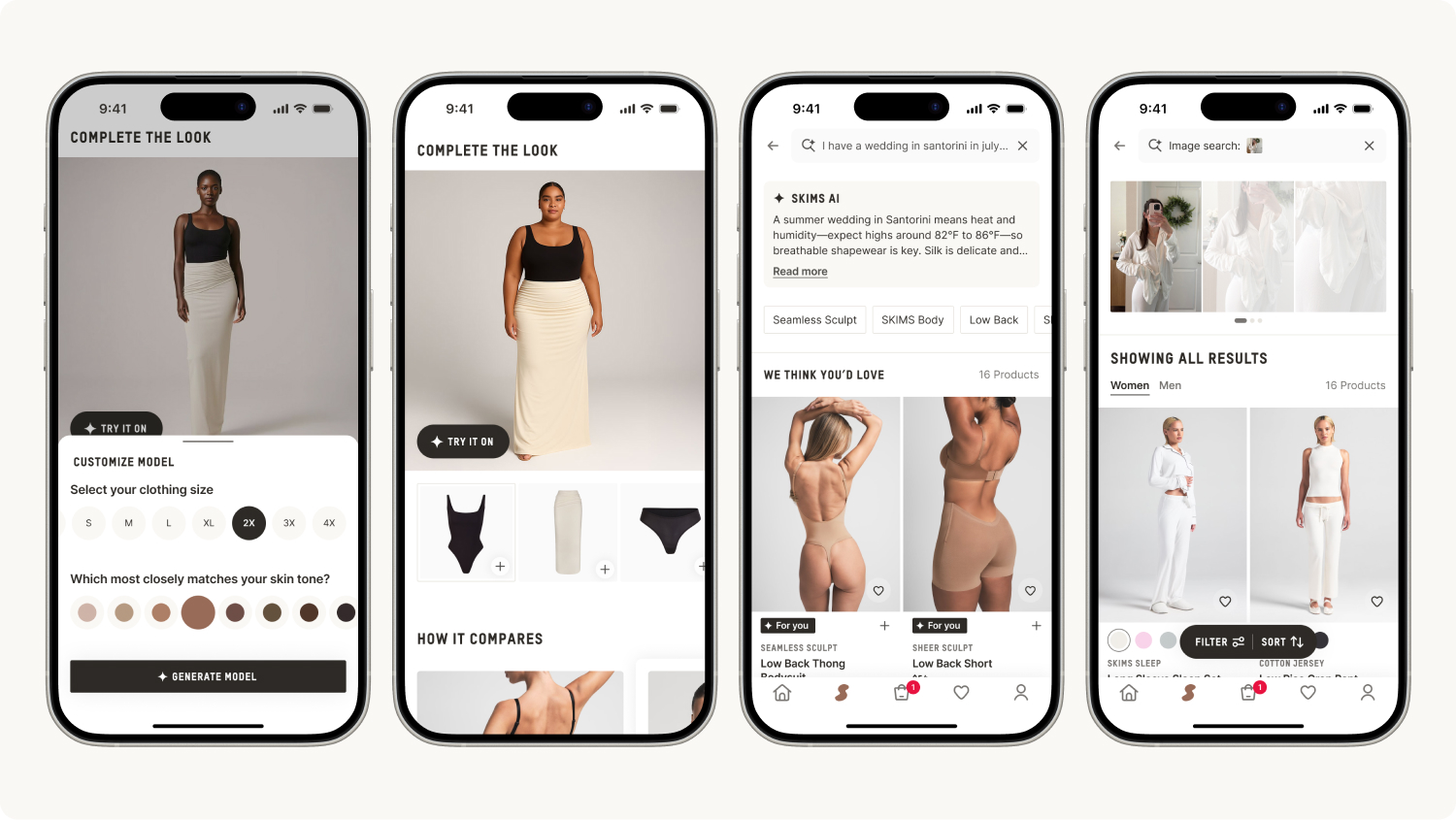
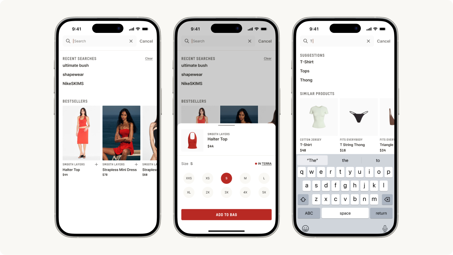
search and conversion optimization
Optimizing search for conversion
When SKIMS migrated from Searchspring to Algolia, there was an
opportunity to redesign the search experience for the North Star of
what search could be. Our previous search experience did not save
past searches, had limited fuzzy search recommendations, and had a
clunky UI. With the redesign, I wanted to optimize for conversion
through quick shop on product recommendations, include past search
history for faster browsing, and product recommendations for fuzzy
search queries.
Within 3 months of launching the new search experience, there was a
137% increase in search usage (with search already converting at
~17%) and a 200% increase in CTR for the bestseller carousel with
quick shop, converting at ~8%.
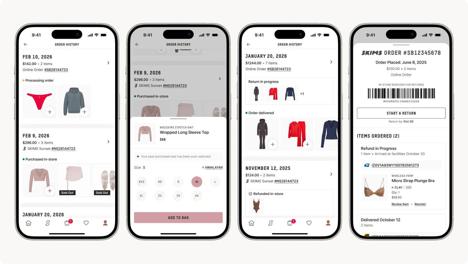
designing for retention
Enabling re-purchasing in the order history
The previous order history flow was a web view, forcing users to
wait for the webpage to load, blocking key information with a cookie
preferences banner, and causing customer confusion with its
duplicative navigation that directed users back to the SKIMS
website’s homepage instead of back into the app. The order history
web view accounted for the most rage clicks in the app.
For the redesign, I wanted to focus on the core pain points within
order history, primarily:
- Confusion on order statuses and return statuses
- Difficulty starting a return
- Friction when repurchasing a past order
App users, as retentive customers, are often are re-purchasing their
favorite styles in new colors. I wanted to optimize for this user
behavior by allowing for quick shop within the order history, with
their past-purchased size auto-selected and the option to easily
change color variants. I also re-organized the hierarchy of the
order history page to be more scannable and intuitive for users to
separate orders in progress from returned items.
View the
prototype.
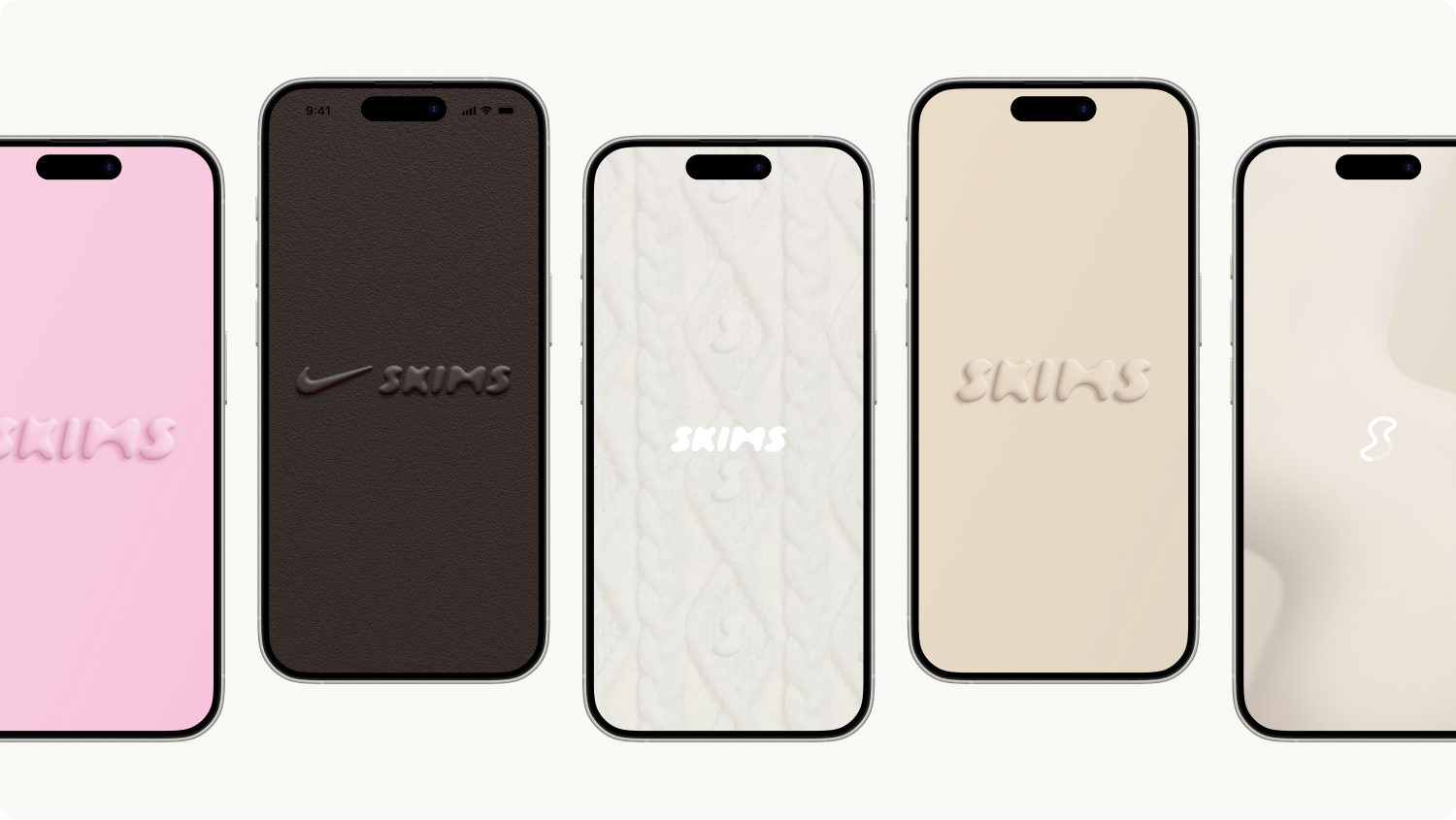
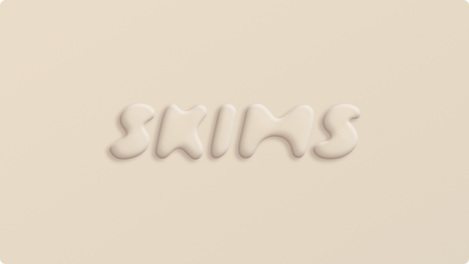
moments of surprise and delight
Seasonal app icon theming
To drive brand excitement and seasonal engagement, I led the design
direction for different app “themes” for high-visibility launches,
including Valentine’s Day, NikeSKIMS, Holiday, and The North Face x
SKIMS. Online SKIMS fans instantly noticed the changes and loved the
seasonal theming. The custom cable knit texture I designed (with a
hidden SKIMS S inside of it) aligned with the Retail design
direction of cable knit-wrapped gifts in stores, bridging the
digital experience with the physical store experience. I also
developed a new evergreen app icon and splash screen that aligned
with the app reskin and Retail design direction, pulling inspiration
from the Venus statues in stores.