kotu brand logo

Collaborative shopping from seller to shopper

When you have a specific item in mind, shopping online can be like looking for a needle in a haystack. So how do you ensure you’re getting the right fabric, the right embroidery, or the right details, without the fear of fraud and misinterpretation?

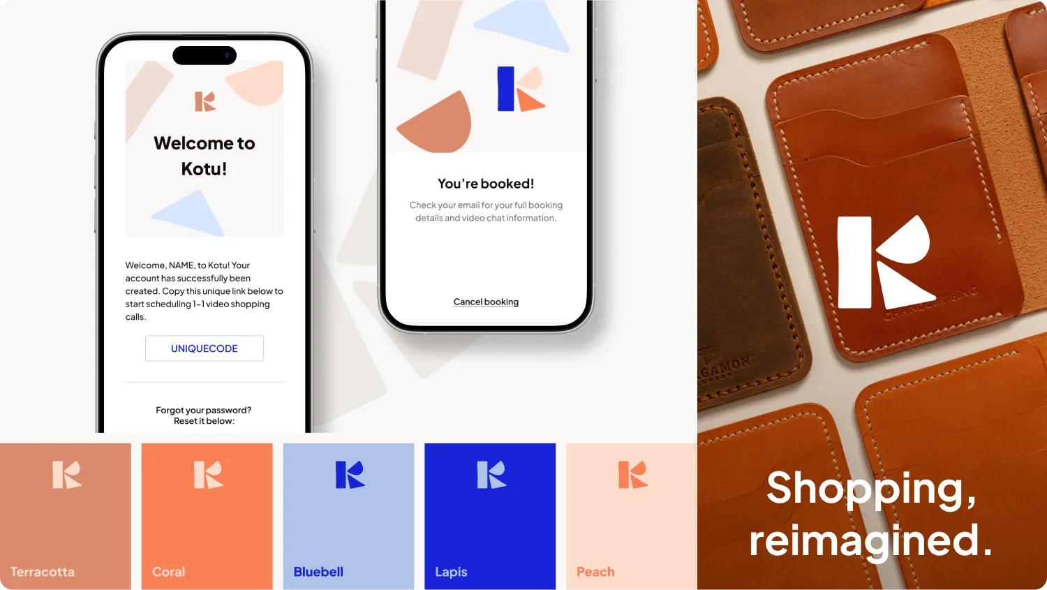
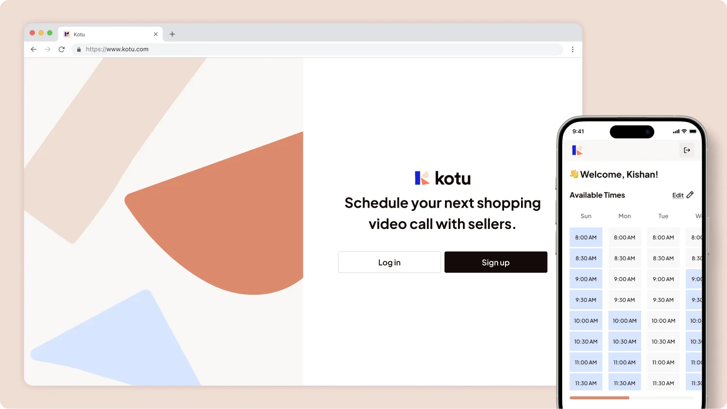
Enter Kotu, the innovative, all-in-one solution for sellers and shoppers to create that special gift, no matter how specific it may be. Through scheduled 1-on-1 video chats, users can create a direct, meaningful bridge between buyer and maker, ensuring every piece is crafted with care, precision, and a personal touch. This is shopping reimagined, where authenticity and craftsmanship meet.

ROLE

I worked to develop the brand’s identity and build out a MVP that can be tested with shoppers and sellers.

This includes:

  • Defining the mood, colors, and brand direction for Kotu
  • Developing the brand traits, values, and manifesto
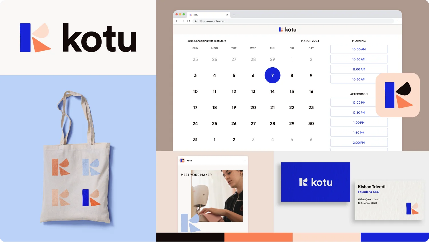
  • Designing a custom logo
  • MVP product design to test the product with real users
  • Building a starter UI component library of interchangeable, organized components for the Kotu team to use for building future features
  • Merchandise and application design
CLIENT

Kotu

DURATION

January - April 2024

SKILLS

Strategy

Brand Identity

Visual Identity

Logo Design

Product Design

UX/UI Design

Developer Handoff

BRAND IDENTITY

For the consciously curated shopper

In a world of mass-produced monotony, Kotu is disrupting customization in retail by connecting shoppers with artisan creators who bring their visions to life. It's more than just shopping—it's co-creating something unique, tailor-made, and aligned with the individual style of the consumer. Similarly, I wanted the brand to feel human, collaborative, and buildable.

Soft earth tones pair with a bright, bold blue hue to create a distinctive, yet grounded look and feel. The shapes forming the letter K of the logo are perfectly imperfect, adding a human touch to a digital icon.

image collage of kotu brand identity with color palette and logo
LOGO DESIGN

Customizing the K

Kotu is all about customization — whether it’s finding the perfect attire for an Indian wedding or fine-tuning the details on a custom-made couch. I wanted to carry over this theme of careful curation in the design of the logo itself. Each perfectly imperfect block can be built up or down to different shapes and configurations, all while ultimately resembling the “K” of kotu. The logo can stand alone as a recognizable mark in any color.

image collage of different versions of the kotu logo
PRODUCT DESIGN

Building out the MVP

Kotu wanted to build a quick MVP to test out their video call scheduling software with real users and artisan sellers. For this lightweight MVP, a seller would be able to create a general calendar of their availability through an account at Kotu and send out a unique link to prospective customers. Customers can easily view a seller’s availability and book a 30 minute video call all in the same ecosystem.

After building out this initial flow for testing, I componetized everything into a robust design system the Kotu team could use for further iterations and testing beyond this MVP. All fonts, breakpoints, and colors were classified with the contrast accessibility and use cases of each color noted for WCAG compliance. Each component was meticulously annotated with hover states, interaction notes, and design specifications.

image collage of kotu product design
screenshot of the kotu homepage with an inset of the kotu mobile app