Redefining the modern luxury e-commerce experience
As the eponymous lifestyle brand of Gwyneth Paltrow, goop has long
been associated with pseudoscience, sensationalized sexual
wellness, and overpriced luxury products. So how do we shift the
public’s perception and drive conversion?
Focusing on goop-owned products, reducing user overwhelm and
confusion, and highlighting the clinical, data-backed results were
key themes when redesigning goop’s website.
ROLE
As the sole Product Designer, I led a site-wide redesign of key
pages and created a seamless developer handoff process through a
robust design system.
This included:
-
Redesigning the PDP to have a scrollable image grid, video,
clinical results, shoppable routines, and highlighted
ingredients
-
Redesigning the PLP to have organized, sticky filters and an
intuitive quick view to show out of stock sizing
-
Redesigning Checkout to be 1-click for logged in users,
allowing for logged in users to update or remove saved payment
methods and addresses
-
Designing a Mini Cart to provide users a quick overview of
what is in their bag, apply promo codes, and shop related
products
-
Redesigning the Homepage with an emphasis on brand and
strategy to address the key verticals of beauty and fashion
with an emphasis on conversion
-
Creating detailed documentation for developers to understand
design components, hover states, and interaction
-
Conducting user research interviews, PURE evaluations, and
internal audits with executives, key stakeholders, and VIP
users
RESULTS
-
Boosted the add-to-cart rate for goop-owned products by 4.9%
and overall yearly revenue by 8%
-
Redesigned size, color, and price filters on the PLP
resulting in a 1050% increase in filter use rate
- Seamless and efficient developer handoff and QA
DURATION
July 2022 - October 2024
SKILLS
Strategy
Product Design
Icon Design
A/B Testing
Developer Handoff
QA / UAT
User research
homepage
Changing the brand’s perception with a new strategic vision
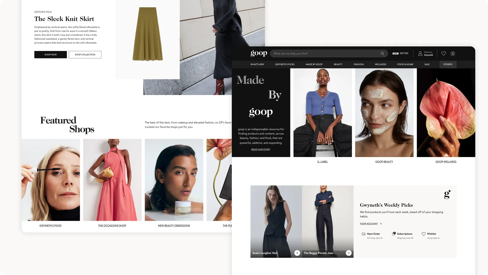
As goop grew and expanded to multiple verticals, mediums, and
products, so did its homepage. Editorial newsletter content is
juxtaposed with e-commerce, creating a confusing and overwhelming
homepage. The redesign was in collaboration with a rebrand to give
the homepage a more cohesive and modern look and feel.
This strategic vision was a part of the larger initiative to focus
on goop-owned and goop Beauty products, create a more shoppable
experience with an emphasis on conversion, and funnel users where
they needed to go through guided discovery. A “Made by goop” section
distinctly highlights the key goop verticals and the “Weekly Picks”
section brings a touch of personalization to the logged in user. The
design direction for this redesign is full bleed imagery and
tightened kernings for a sleek, modern look.
View the
desktop prototype. View
mobile prototype.

product list page
Shortening the funnel
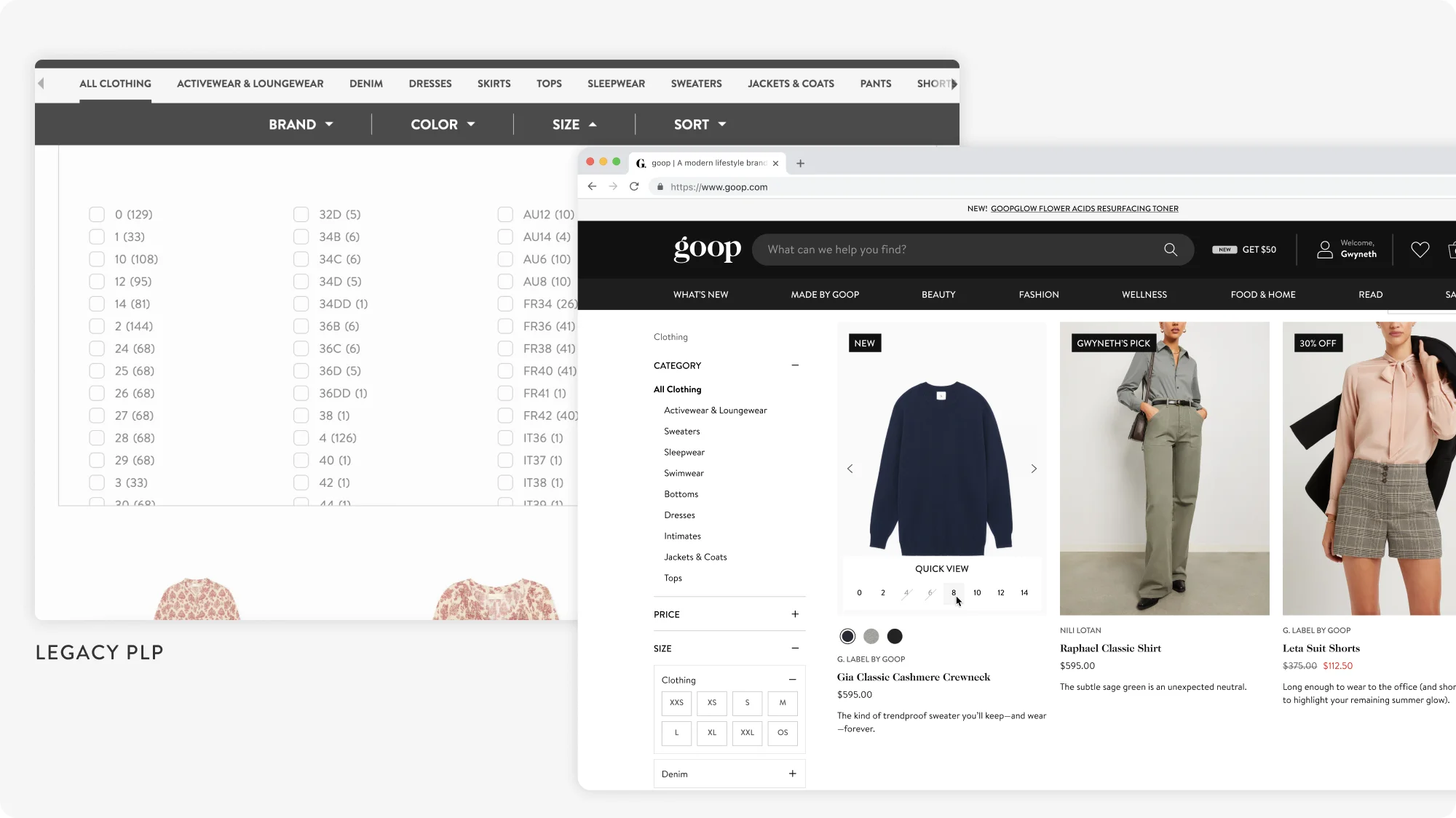
The legacy PLPs were functional, but not as optimized for conversion
as they could have been. Filters were at the top, hidden once you
scrolled past them, and contained a wide range of colors and sizes.
Since goop is a multi-brand marketplace, there are no uniform sizes.
A size small could also be a 24, a FR 34, or a UK 8. To filter for
blue items, users had to select all different shades of blue — from
sky blue to teal to navy.
Organizing filters for improved use and scannability
The first step was to map all of the size and color filters to
easily scannable filters. I chose to group sizes by category
(general clothing, bottoms, shoes, and intimates) and by letter (XS,
S, M, L, XL) for improved scanning and legibility. Filters were
available in a sticky sidebar on the left side of the page,
conventional to the e-commerce mental model.
Quick(ly) shop at your fingertips Quick
Shop is an efficient and easy way to shorten the funnel and convert
users from the PLP. While most legacy e-commerce sites have one
simple “Quick Shop” button that opens up a modal, we decided to
innovate to be more on-par with e-commerce UX leaders by not only
showing the full image carousel on the product card, but also
highlighting available (and out-of-stock) sizing. From the PLP, a
user can now easily see all views of a product, scan to see what is
in their size, and add a product to their bag.
View the
desktop prototype.

product display page
Leading with visuals, converting with numbers
Our legacy PDPs weren’t as high-converting as they could have been,
so through competitor benchmarking and user interviews, we
identified primary ways to improve upon the design and convert more
users:
Utilize an image grid for product imagery and incorporating
video
One of the primary reasons clothing items are returned is due to the
wrong fit. By surfacing the images upfront so a user doesn’t have to
click into a carousel and adding video content showcasing the fit
and movement of a G. Label clothing piece, we created an easier,
more-informed experience with fewer click barriers that would
prevent users from converting.
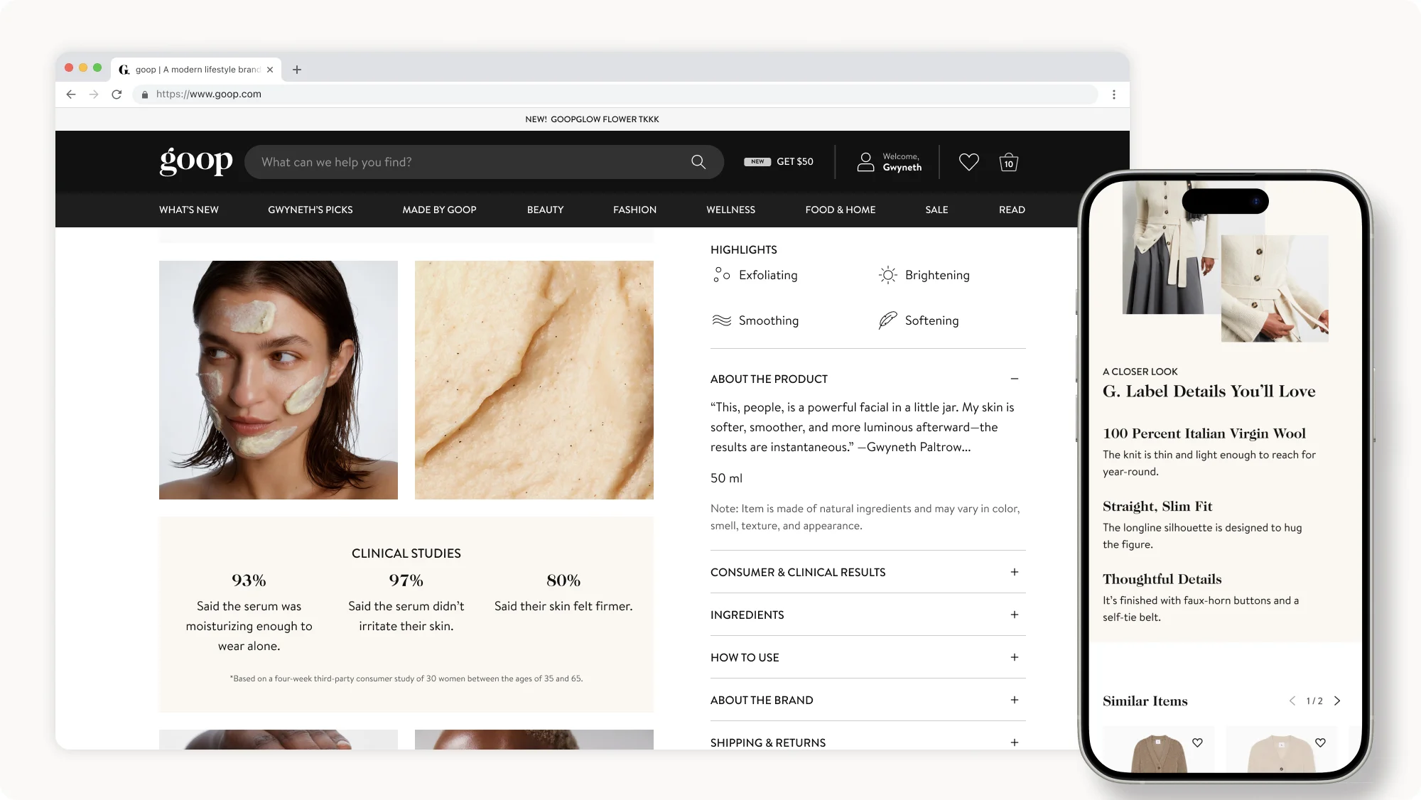
Highlighting clinical data, ingredients, and quick factsGoop Beauty products, contrary to popular belief, are
research-backed with unbiased clinical data and incredible
ingredients. However, this key information was hidden within a “more
details” accordion. I designed “content blocks” to emphasize the
clinical results after 4 week studies within the image grid, created
unique icons to quickly showcase what made the product special for
users scanning the page, and made “ingredient blocks” to highlight
the 3 hero ingredients of a goop Beauty product. Similar to the
“ingredient blocks”, on G. Label products I designed a “details
block” that focused on the key details of a G. Label product that
make it unique.
View the
Fashion prototype
and the
Beauty prototype
.

CHECKOUT
A one-click experience for seamless conversion
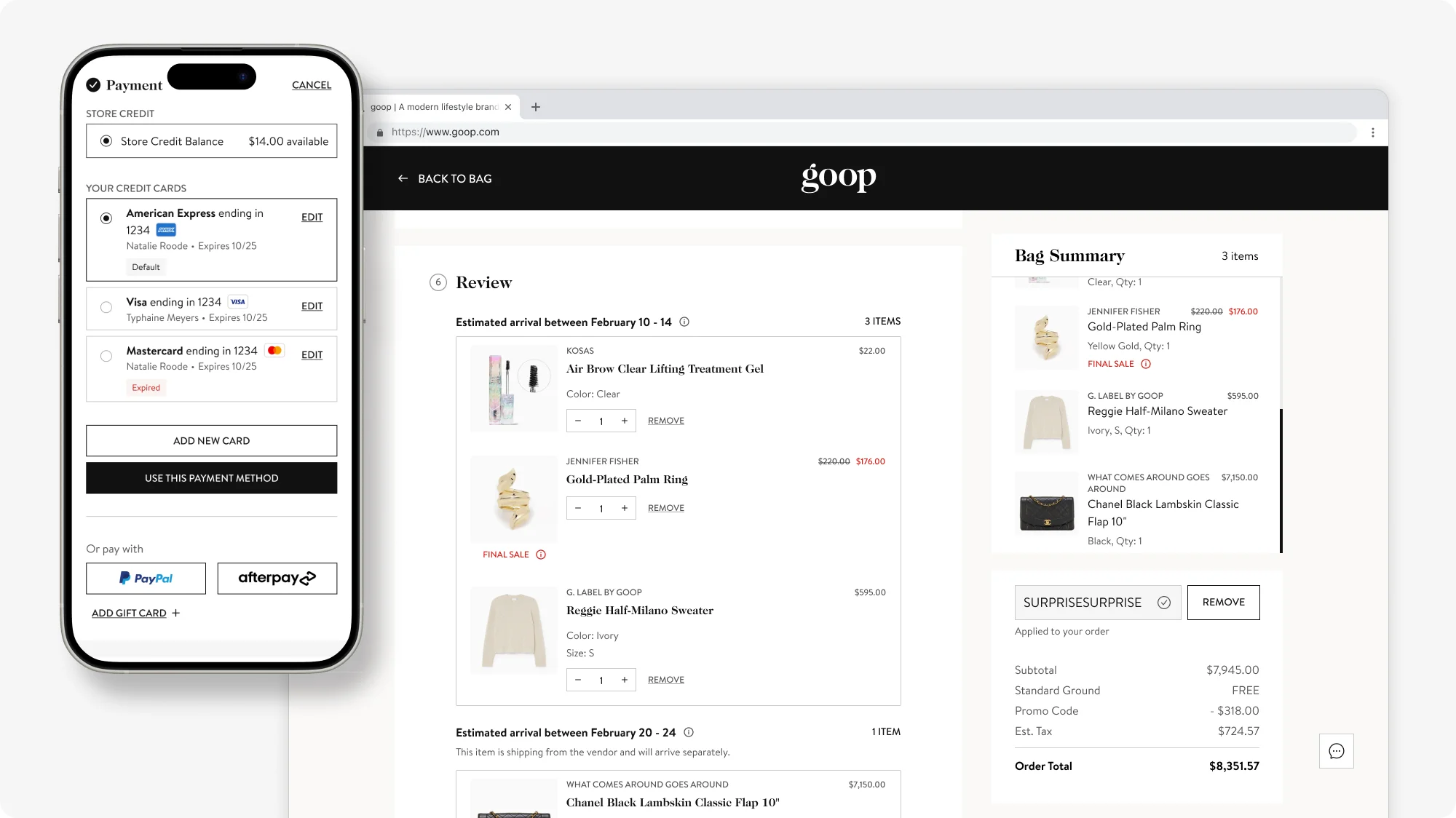
Our legacy checkout was functional, but painful. Users had to click
multiple times to get to the end of checkout, even if they were
logged in users, leading to high drop-off at this crucial end of the
funnel. Additionally, there was a lack of feedback to the user
regarding shipment times (specifically with multi-brand drop-ship
vendors), delivery options, and promo codes. Through collaborative
brainstorms with cross-functional stakeholders and multiple user
interviews with CX team members and VIP customers, we identified the
primary pain points to address in the redesign.
The redesign aimed to simplify the process through a seamless
one-click checkout experience for logged in users with the ability
to update and manage saved payment methods and shipping addresses.
If an item was shipped from a different vendor at a different time,
it would be displayed as visually separate from the other items in
the order to intuitively communicate to the user that it was a
drop-shipment (with hoverable tooltips to explain the details too!).
Finally, the redesign took the guesswork out of promotions by
providing clear feedback to a user if a promo code applied to their
order, only applied to specific items, or was not applicable.
View the
desktop prototype.

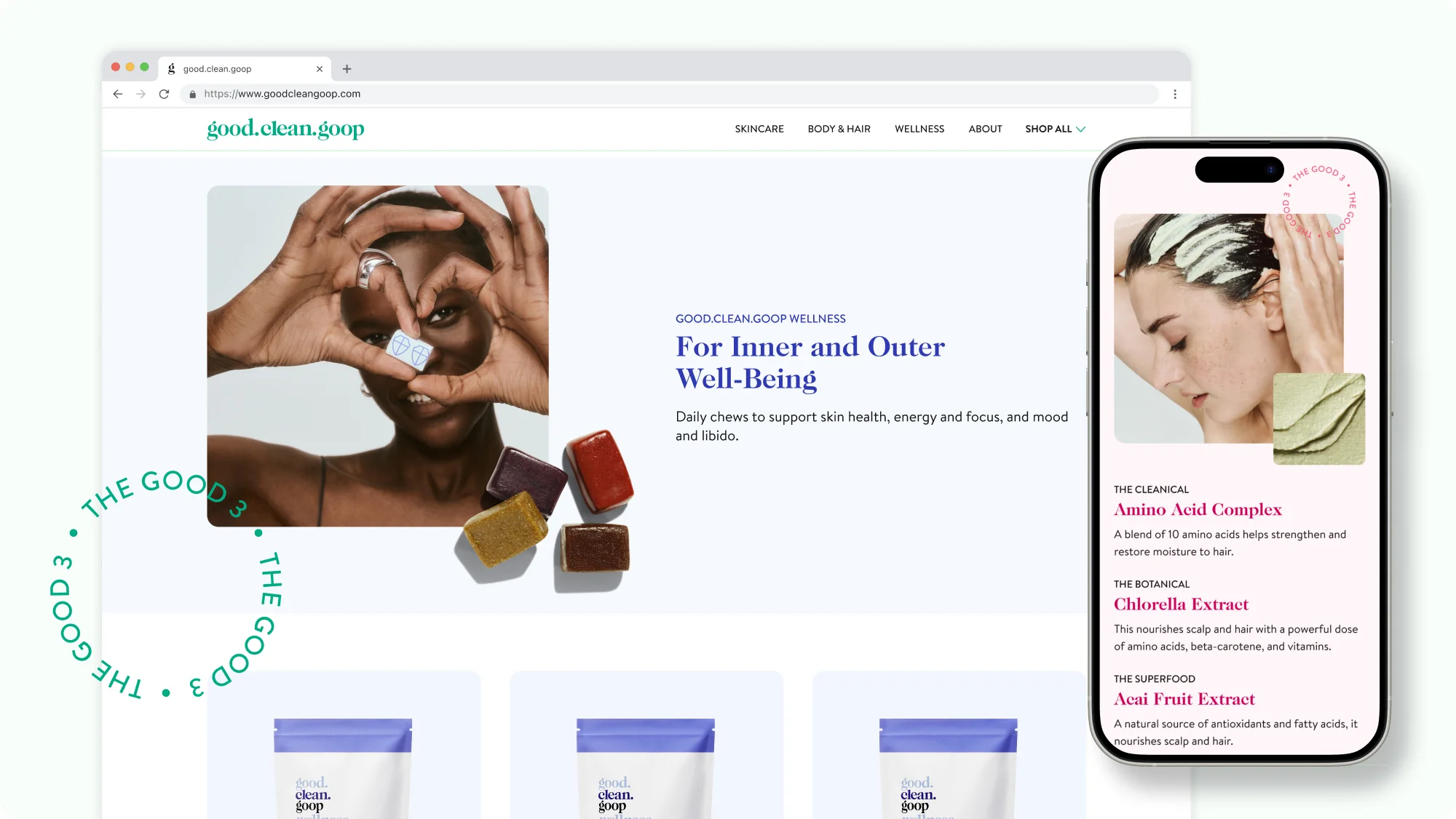
microsite design
Designing the site experience for a sub-brand
In 2023, goop launched good.clean.goop in collaboration with Target
to broaden the brand to a younger, more price-conscious demographic.
The brand direction was colorful, youthful, and attainable — in
direct contrast to goop’s design direction of minimal modern luxury.
The microsite used colorful backgrounds to differentiate between the
different verticals (beauty, wellness, and body-care) and played
with layered textures, circular motifs, and product stills.
View the
microsite.

WORK TESTIMONIALS
“From the start, Sylvie’s skills in UX design, prototyping,
interactive design, and component documentation were impressive. She
went beyond expectations and improved how we worked, keeping the
user in focus and making problem-solving more effective. Her
attention to detail and high standards raised the quality of
everything we did, and her presentations were always well-received,
even by the CEO.”
– Rodrigo Garcia, VP of Product Engineering
