Redefining home renovation
The home renovation industry has been plagued by a reputation for
cutting corners and working decades behind the times. Made by
millennials, for millennials, Forma Homes is redefining what home
renovation can be: transparent, reliable, and refreshingly modern.
ROLE
I worked to develop the brand’s visual identity and set the
creative direction for the modern contracting company.
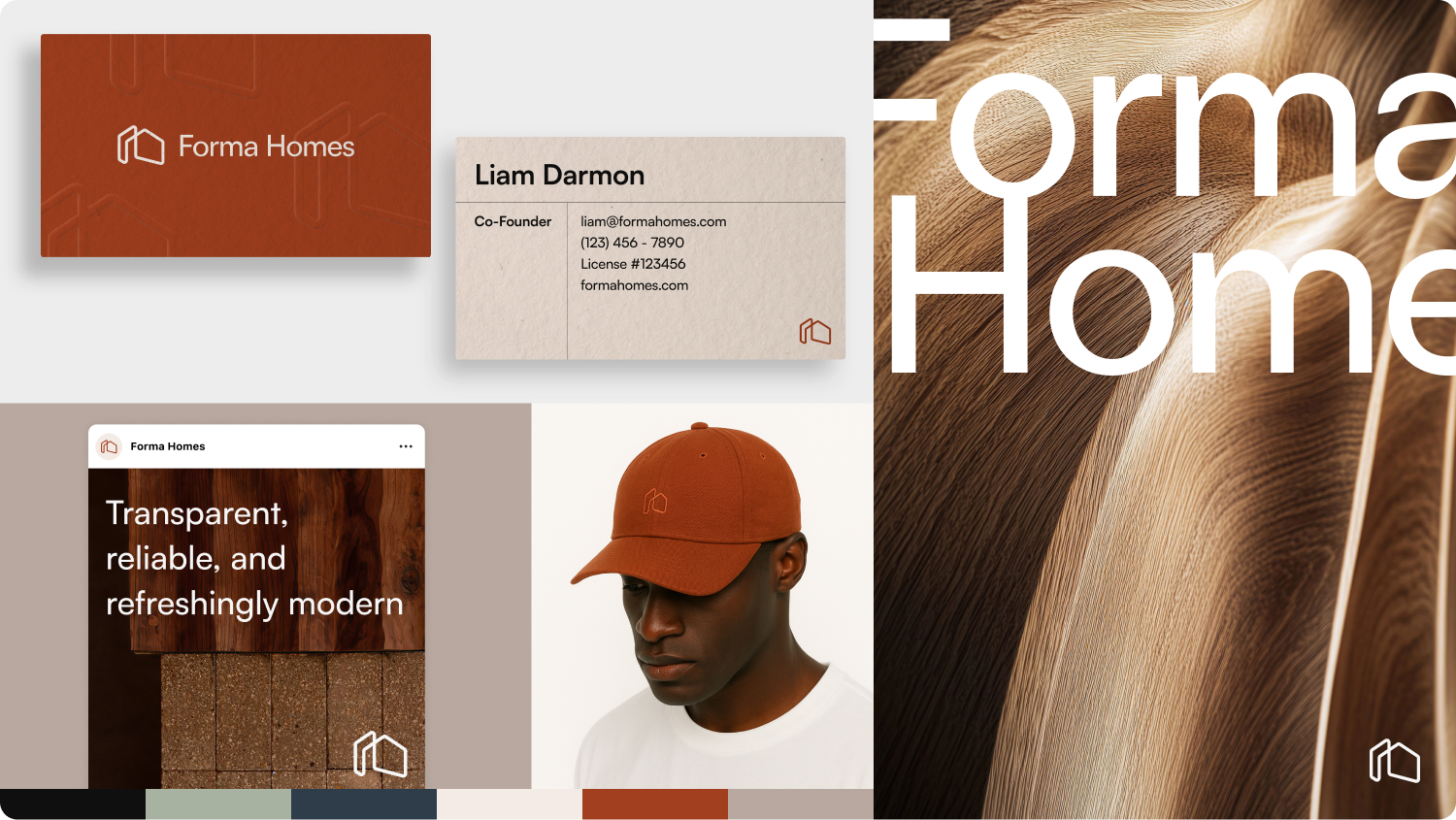
This includes:
-
Defining the mood, colors, and brand direction for Forma Homes
- Developing the brand traits, values, and manifesto
- Designing a custom logo
- Business card design
- Homepage and social mockups
RESULTS
Forma Homes launched as a brand with notable clients throughout
Beverly Hills, Hollywood, and Brentwood.
SKILLS
Strategy
Brand Identity
Visual Identity
Logo Design
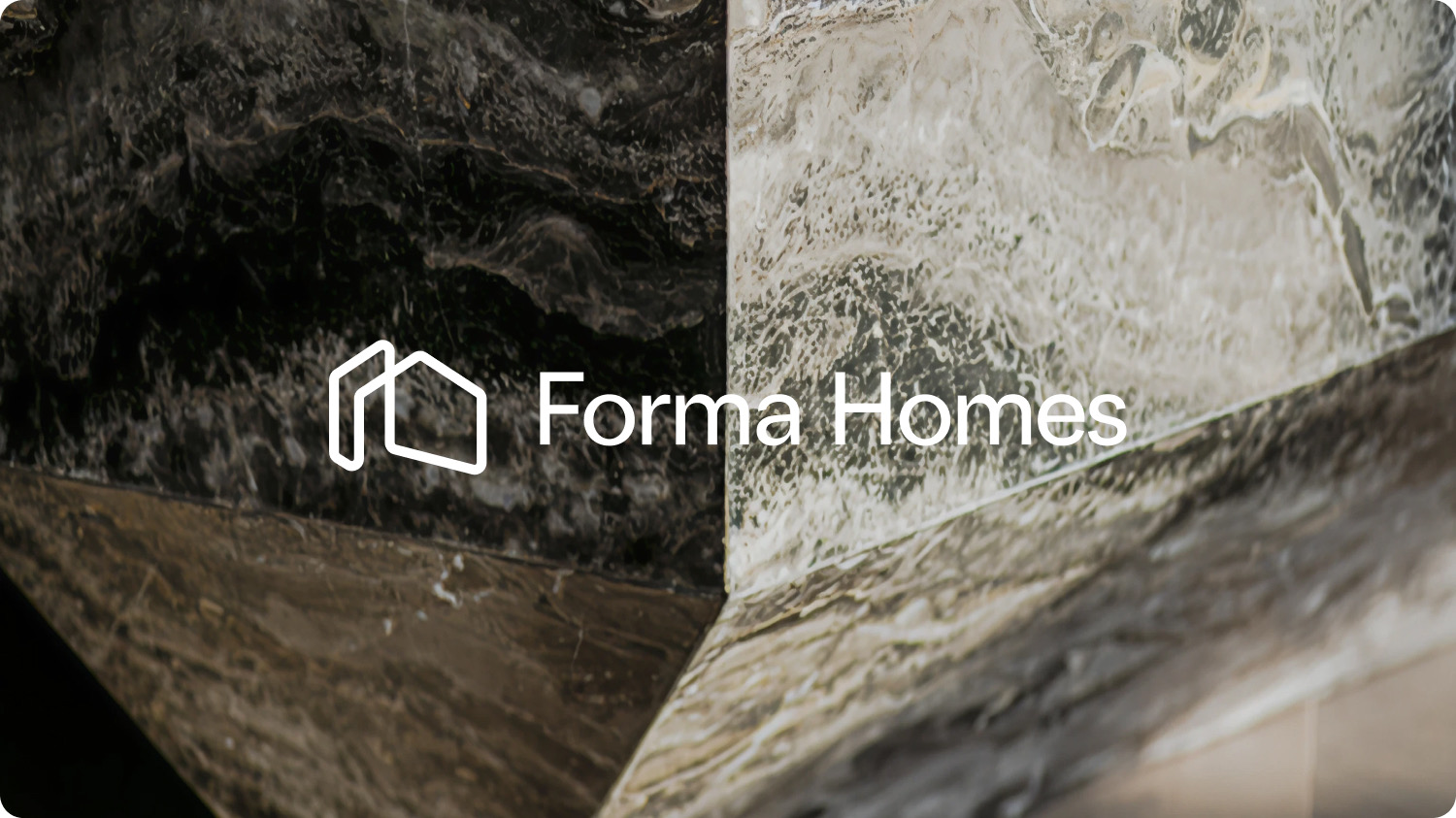
BRAND IDENTITY
Organically modern, for the millennial homeowner
The millennial user expects transparency and modernity at every
touchpoint, so why shouldn’t that apply to general contracting? I
wanted to position Forma Homes with a clean and minimal identity,
focusing on the natural materials of an organic modern interior. Earth
tones, geometric sans serif fonts, and minimal single line logo marks
dominated this design direction.
In an industry dominated by outdated branding, this identity sets
Forma Homes apart by reimagining home renovation through the modern
editorial lens of Architectural Digest.
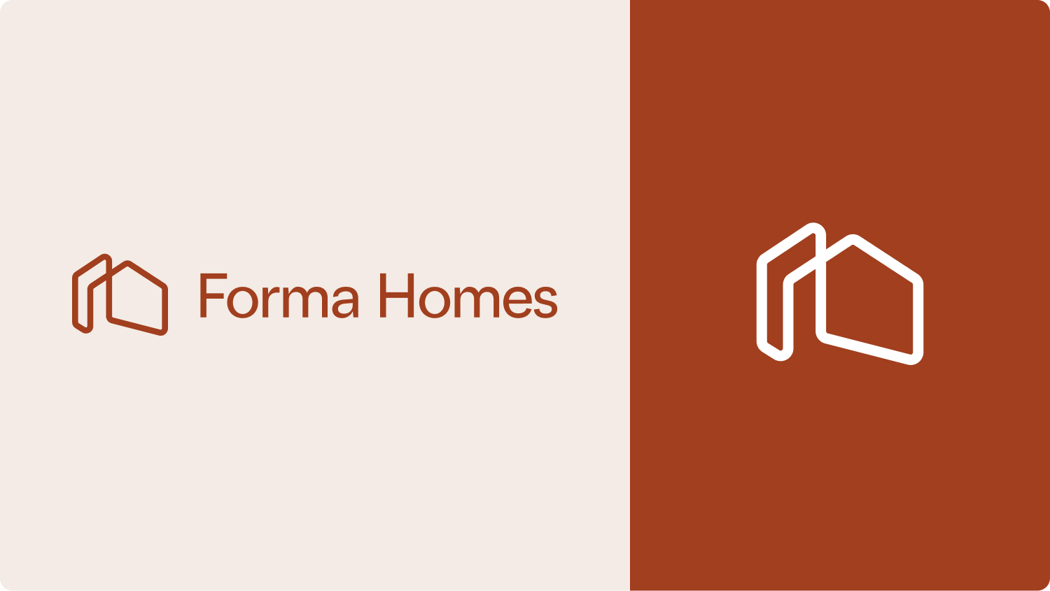
LOGO DESIGN
Back to the blueprint
I wanted the logo to reference the roots of home renovation and
construction, yet still be a modern, repeatable shape that could be
used anywhere on any background. The singular line bends and forms an
optical illusion that mimics the shape of a home. I wanted the logo to
reference the blueprints and drawings contractors use on jobs every
day, while still maintaining a unique and contemporary positioning.
The wordmark has slight refined curves to give the sans serif font a
more organic, calligraphic look and feel.
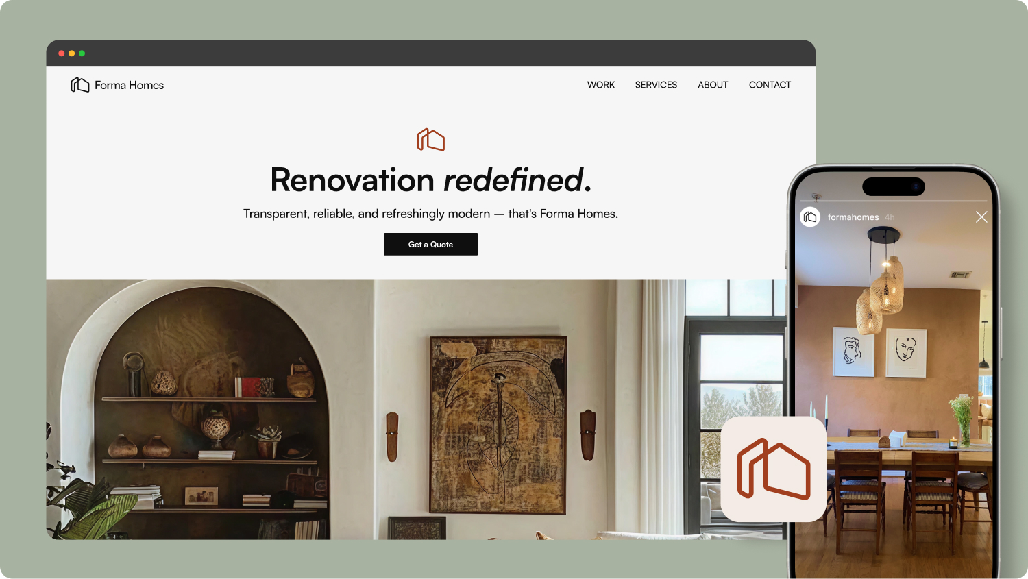
brand applications
Web and Social Design
Forma requested some initial concept mockups to get an understanding
of how they could apply this branding to a modern website and attract
new clients. The design direction is minimal and image-forward,
letting the quality of the work itself fill the pages.