Overview.
Duration: June 2019 - March 2020
Tools + skills: Sketch, UX/UI design, competitive analysis
Due to nondisclosure agreements, I cannot name the company this project was done for and have omitted and obfuscated certain confidential information.
The problem.
This well-known legacy brand was falling short compared to other competitors due to its clunky, inconsistent, and outdated user experience and user interface. Active buttons were gray, typography and colors varied across different products, and the content strategy itself created a difficult-to-navigate user experience. The primary issues I wanted to tackle were:
- Inconsistent components and designs across different products
- Poor UX and accessibility on the site
- Navigation across different products and services
How might we elevate both the user experience and the visual design of this brand to industry standards, while still retaining its unique branding and history?
The biggest challenge of this site refresh was creating one product from 9 different sub-products of this legacy brand. When I first began designing a vision, I went as far away from the brand as possible, letting my creativity roam free. The primary themes I wanted to focus on were:
- Look and feel — I wanted the site to feel airy, with lots of visual breathing room, but evoke energy, friendliness, and expertise. This would not only bring the brand up to industry standards, but also set it apart from other competitors.
- Breaking the grid — A large part of the current site is its rigid, formulaic grid system. With this vision, I wanted to visually break these conventions, while also still utilizing a grid system. This would create visual dynamism and bring the user down the page.
- Updated imagery — Imagery, especially stock imagery, can often fall into the cheesy, corny category. For this proposal, all imagery was realistic, vibrant, and followed specific rules (subjects cannot look directly into the camera, images weren’t over or under-saturated, etc).
One of the biggest challenges was actually scaling down to something more feasible (both technically and with the brand itself). A large part of the final design was compromise—with product owners, content writers, and developers. This included maintaining a grid and more "formualic"-looking components for MVP.
My role.
What began as a simple pitch to a specific team blossomed into a full site refresh. The company was undergoing a content management system upgrade and needed a design direction for MVP, which is where I was able to step in. As the sole UX/UI designer on this team, I worked across various products and with product managers, product owners, developers, content writers, and marketers to:
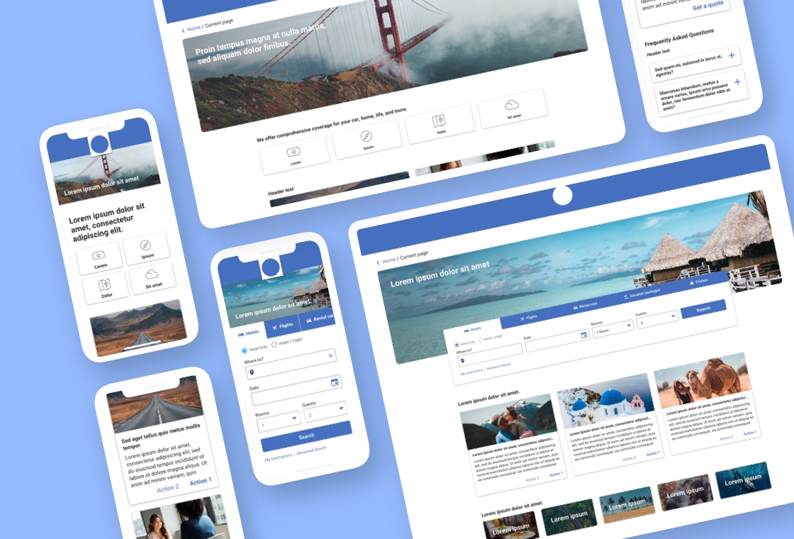
- Create a mobile-first, comprehensive system of interchangeable components to be used site-wide
- Set consistent color, typography, and UX standards across the site
- Introduce new, future-state ideas for the visual design to set the brand apart from competitiors
- Work closely with developers and content writers to spec and QA created assets and pages
The solution.
My solution was to create a mobile-friendly design with interchangeable components, updated icons, and consistent breakpoints.
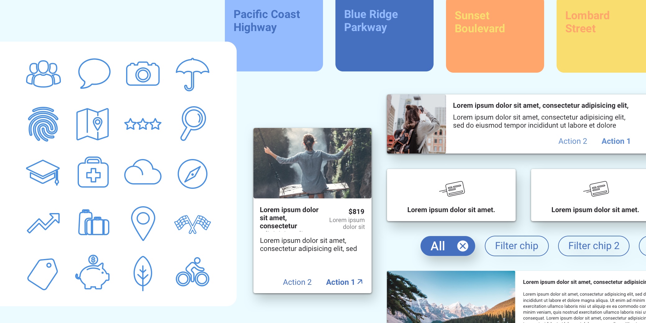
- Icon library — The current site utilized large, filled in icons with colored circular backgrounds and drop shadows, all visual indicators that the icon is clickable. These icons, however, were not clickable but instead static elements used to break up the page and add more visual dynamism. For the refresh, I decided to transform all the icons into line art, removed the colorful backgrounds and drop shadows, and rounded the edges for a cleaner, friendlier look that visually communicated “static” to the user. A small set of icons were reserved to be specific to each product.
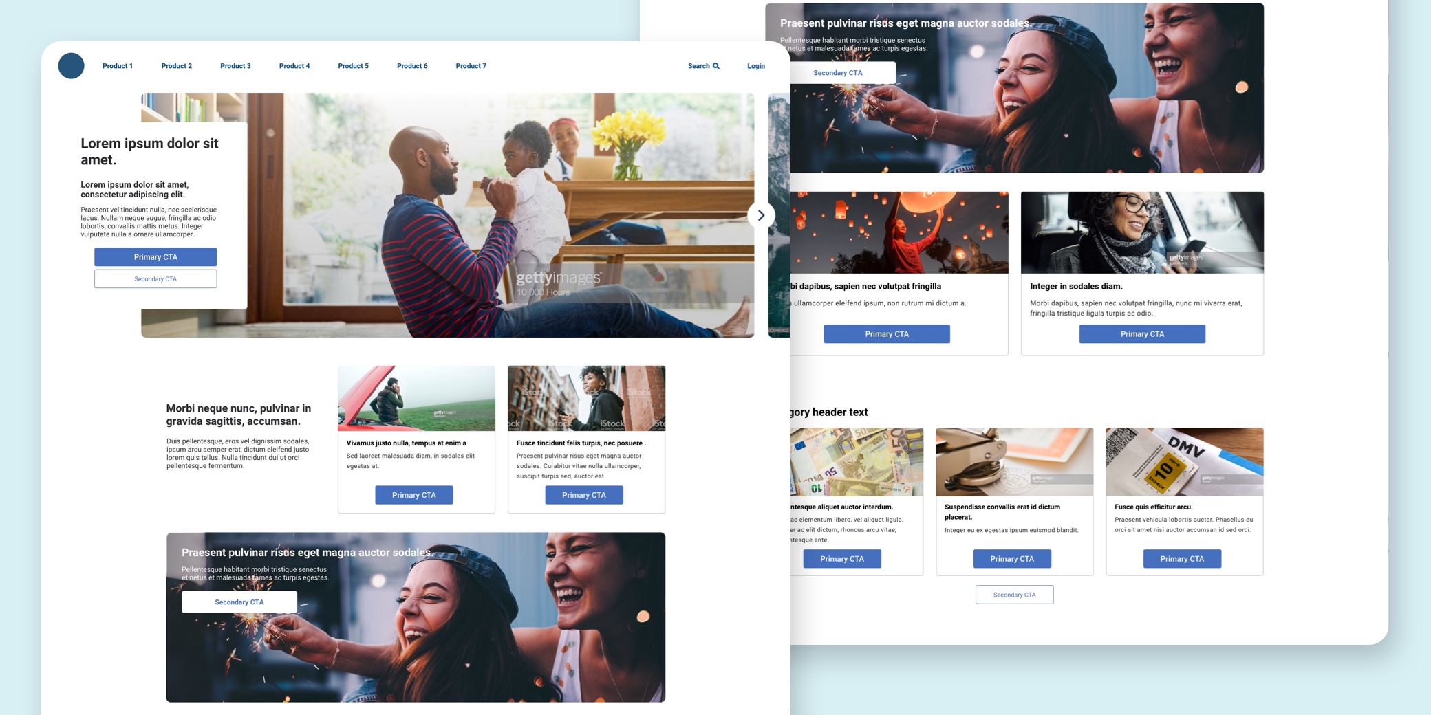
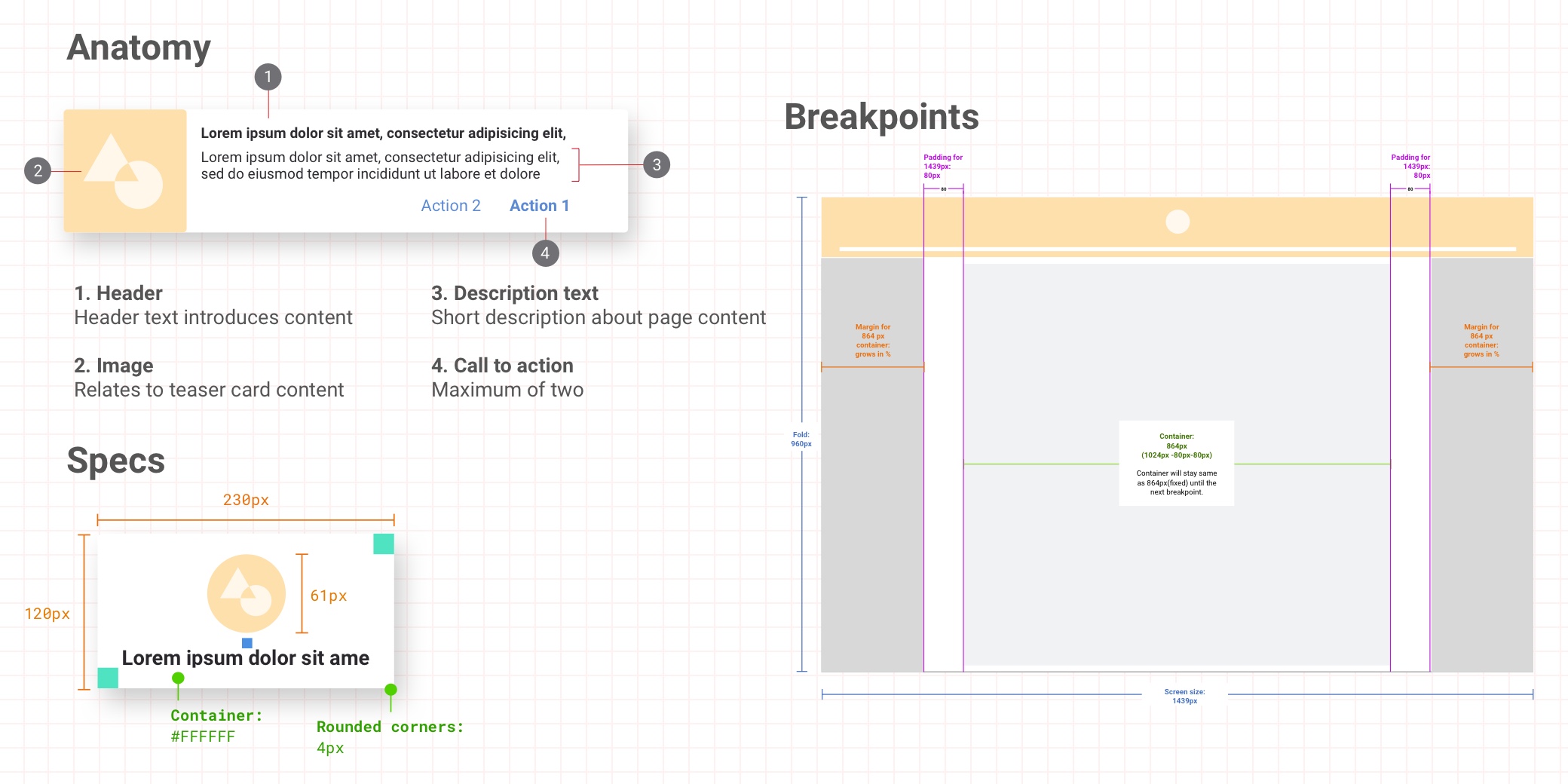
- Cards, tiles, pills, accordions, and more — A large part of this modular system was the creation of clickable cards that could be used across the site and with every product. All products would use these components, creating a unified and seamless experience across the site. There were 6 variations on the card system (Hero, Teaser, Universal, Marketing, Form, and Floating Box) and all clickable components (cards, tiles, pills, accordions and modals) had a drop shadow indicating user interaction. Static elements, such as icon/image rows and blog components, do not have drop shadows and use the static, line-art icons.
- Consistent breakpoints — Different products across the site had different containers. By creating standardized breakpoints, the entire site would have a consistent look, feel, and experience. Each screen size from iPhone 5 to large desktop had a consistent set of rules until the next breakpoint.
Future state ideation.
Some of the future state ideation included creating dynamic illustrations for each product page as a way to move away from lifestyle stock imagery (which can be read as corny), while still visually highlighting the product. The design direction I led for these illustrations was clean, minimal, and friendly, with pops of bright color.
Another future-state proposal I pitched was broadening the brand’s colors for web. I wanted the colors to evoke the feeling of the brand, not just literally depicting what the brand itself is. Each color tied into the history of the brand and was bright, minimal, friendly, and helpful. I also created a style guide for Marketing to use with these new colors and icons, outlining proper and improper uses (as Marketing had previously been given free rein of all assets and colors, therefore causing inconsistency in the brand).