Overview.
Duration: August - October 2018
Tools + skills: Figma, Adobe Photoshop, UX design, user research, journey mapping, personas, wireframing, prototyping, UI design
About the project: Created for a UX/UI design class, the intent of this project was to redesign an existing brand’s user experience and interface, finding pain points and addressing them through the redesign. Github, despite being a powerful and industry-standard tool, has a fairly large barrier to entry for novice users. Its design gears it towards only one type of user: a programmer. I wanted to reduce this barrier to entry and broaden its user base to users of all different levels of computer science.
The problem.
As a novice user, I found Github to be extraordinarily difficult to use. I found its emphasis on social sharing to be redundant and distracting, slowing down the overall experience of finding and sharing your code. After conducting user research interviews of three varying levels of Github users (novice, developer, and Computer Science professor), there were three items I wanted to tackle with this redesign.
- Search — Github’s search functionality often returned inconsistent results. If you were in your own repository, it would search that first before searching globally, without properly indicating where it was searching to the user.
- Finding repositories — I wanted to make the path to a user’s repository as simple and seamless as possible. Currently, users land on a page that shows who they’re following (and the current activity of those users) with repositories on the far left.
- Explore functionality — While Github’s “social network” attempted to inspire discovery of new repositories, ideas, and code, it was more distracting than useful. However, one of the most common complaints from users was that there really wasn’t a way to explore new code easily.
How might we create a more digestible Github for a wider range of users, from novice to advanced?
My role.
For this project, I was redesigning the product from start to finish. This included conducting various user research interviews, journey-mapping, redesigning user flows, and creating low and high fidelity wireframes for the improved design.
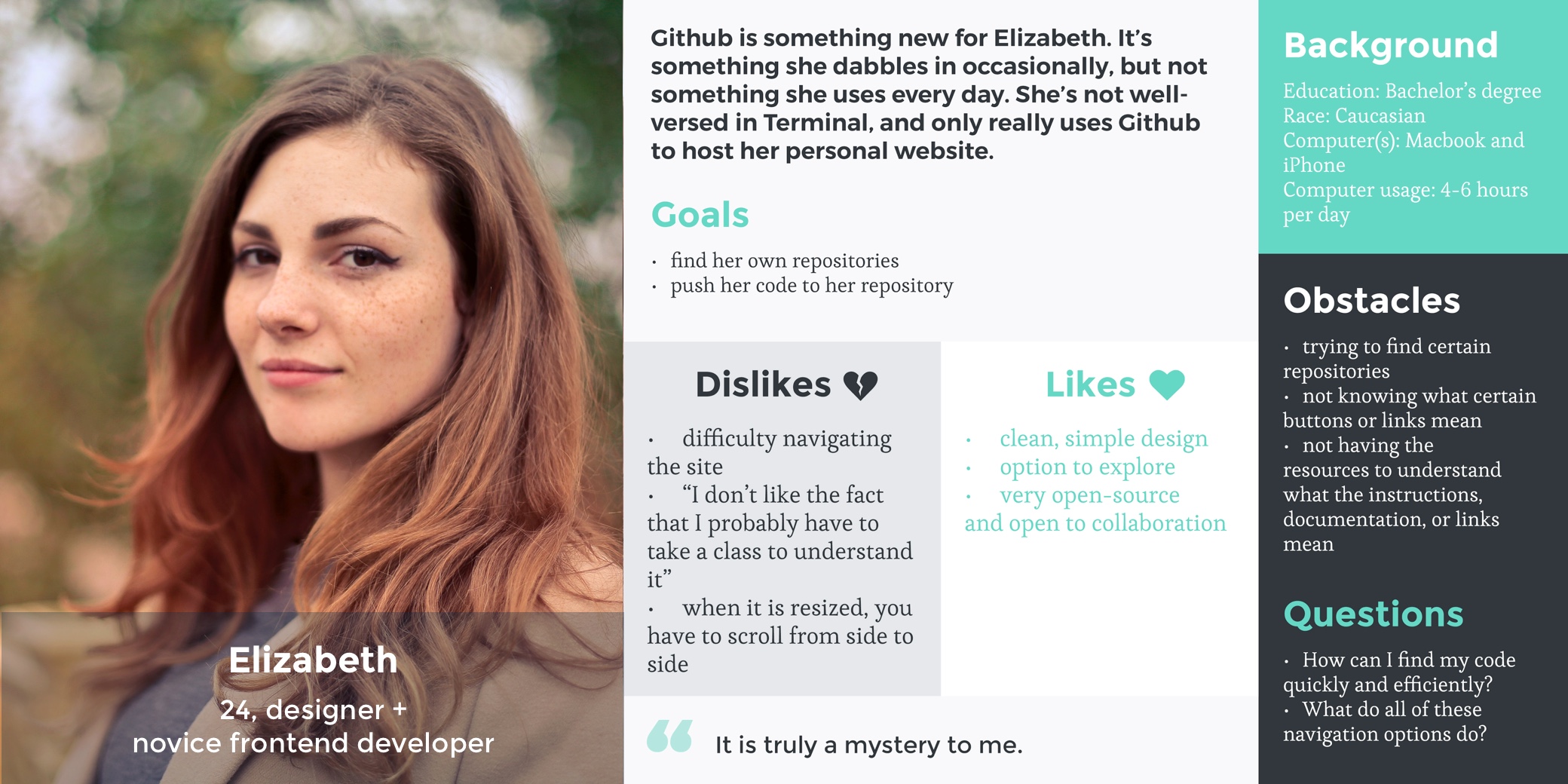
I began by interviewing users of varying levels of experience with Github. Elizabeth’s interview stood out in particular, as her main frustrations were her inability to find what she was looking for and the lack of resources to understand the platform itself.
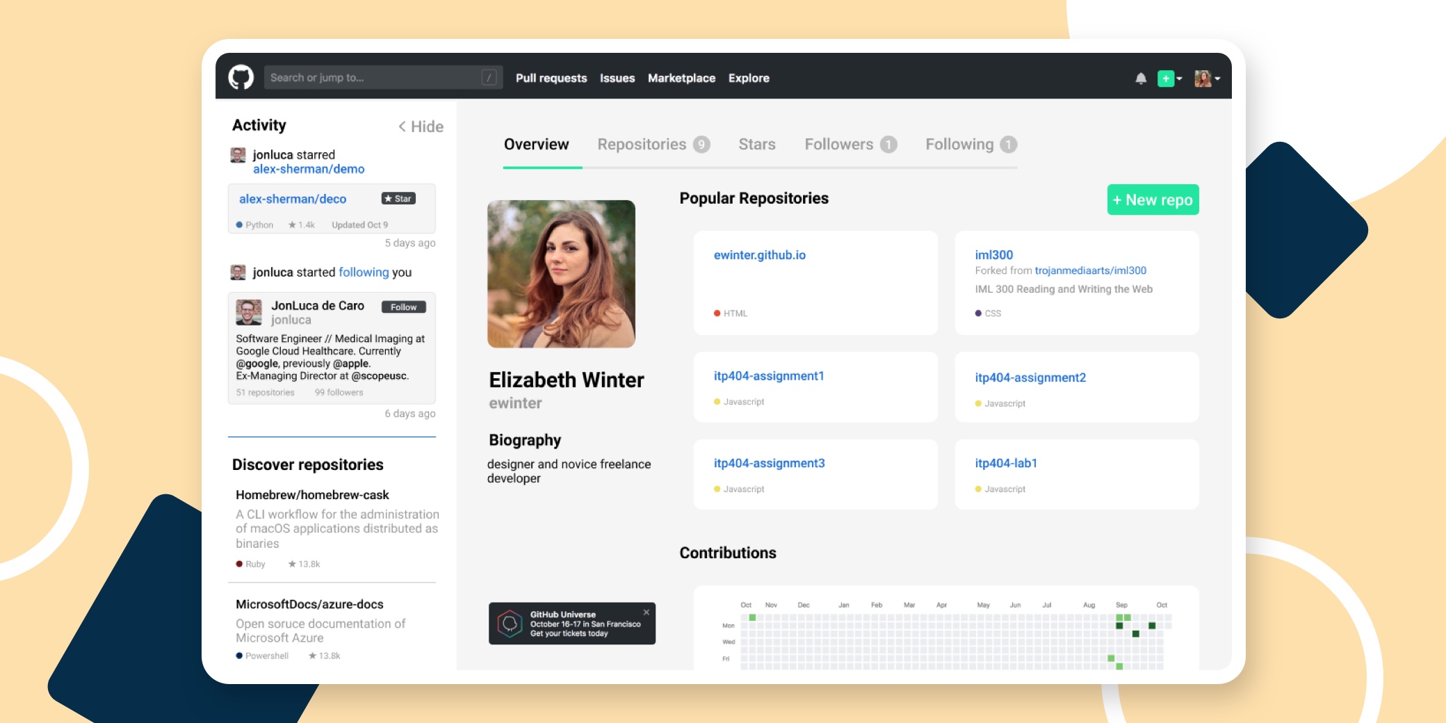
The solution.
- Land users in their own dashboard — This cuts out any unnecessary or distracting visual noise and gets users directly where they need to go: their repositories. The redesigned dashboard would highlight their top repositories with an easy tab navigation to get to all of their repositories, starred repositories, followed users, and users who follow them.
- Social on the side — I put the “social media” aspect of Github into a navigational “drawer” on the side. This would show recent activity from followed users (with the option to show more or less) and popular repositories or code on Github. Users would have the option to hide the drawer (which would slide the drawer to the left), if they didn’t want to see the extra information.
- Global search, simplified — While Github does currently utilize global search, it is not communicated to its users. In this redesign, Github would return the top results of the search query first, which would be anything that most closely relates to the search itself. A navigational tab bar above would highlight specific categories that the search query returned results in. For example, it would show 9 repositories that had similar keywords to the search query and 1 user. When users click on each tab, the information filters to only that category, making search faster.