Overview.
Duration: December 2020 - August 2021
Tools + skills: Figma, UX/UI design, product design, competitive analysis, presentation design, branding
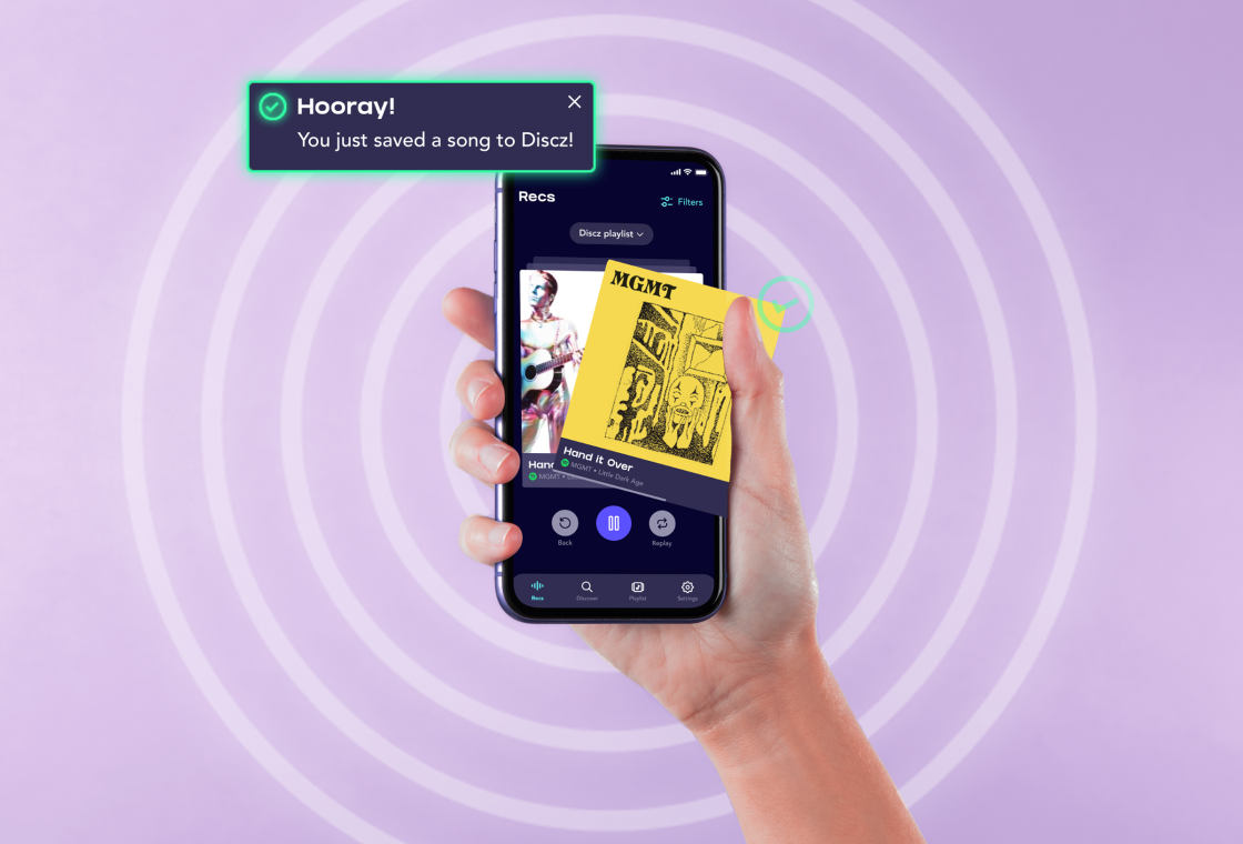
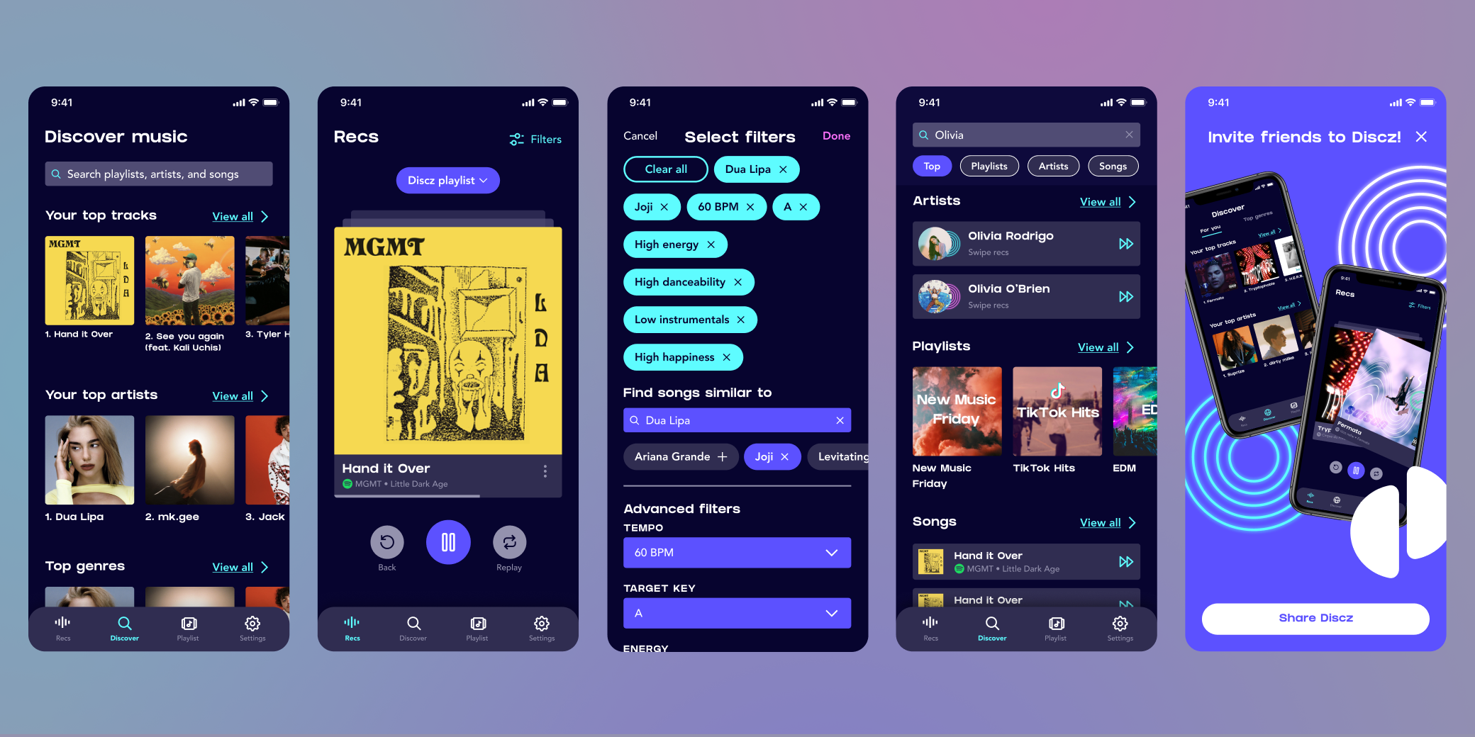
Discz is a music discovery app that leverages the Spotify API so that users can swipe new recommended songs based off of their Spotify listening habits to add them to their favorite playlists.
The problem.
While music consumption has shifted to primarily online streaming, many users crave ways to discover new music. However, many online platforms make it difficult to explore or discover new music, leading to user fatigue. Additionally, most users described recommended playlists as “hit or miss,” and wished there were more tailored recommendations.
The primary issues we aimed to tackle were:
- User fatigue and overwhelm when finding new music
- Designing an app that is inspirational, but not intrusive
- Creating a sticky, gamified user experience
How might we help users to find new music without impeding a user’s music listening journey?
The solution.
Discz allows users to quickly find new music by swiping through 30 second snippets of songs. A swipe right adds a song to a playlist, while a swipe left discards it. Users can even filter by BPM, key, or find songs similar to their favorite artists, playlists, or genres.
My role.
As the primary designer, I worked with both co-founders to:
- Create the mood, tone, and design direction for Discz.
- Design the logo, submarks, patterns, and textures.
- Design the user experience and user interface of the Discz app to bring it to market.
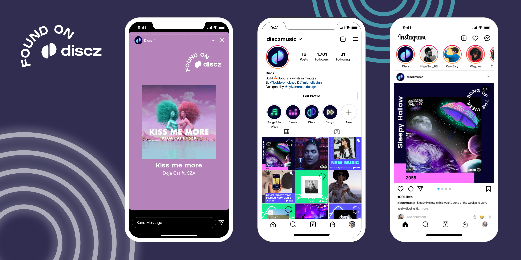
- Create social media templates for the Discz team to use to promote their app.
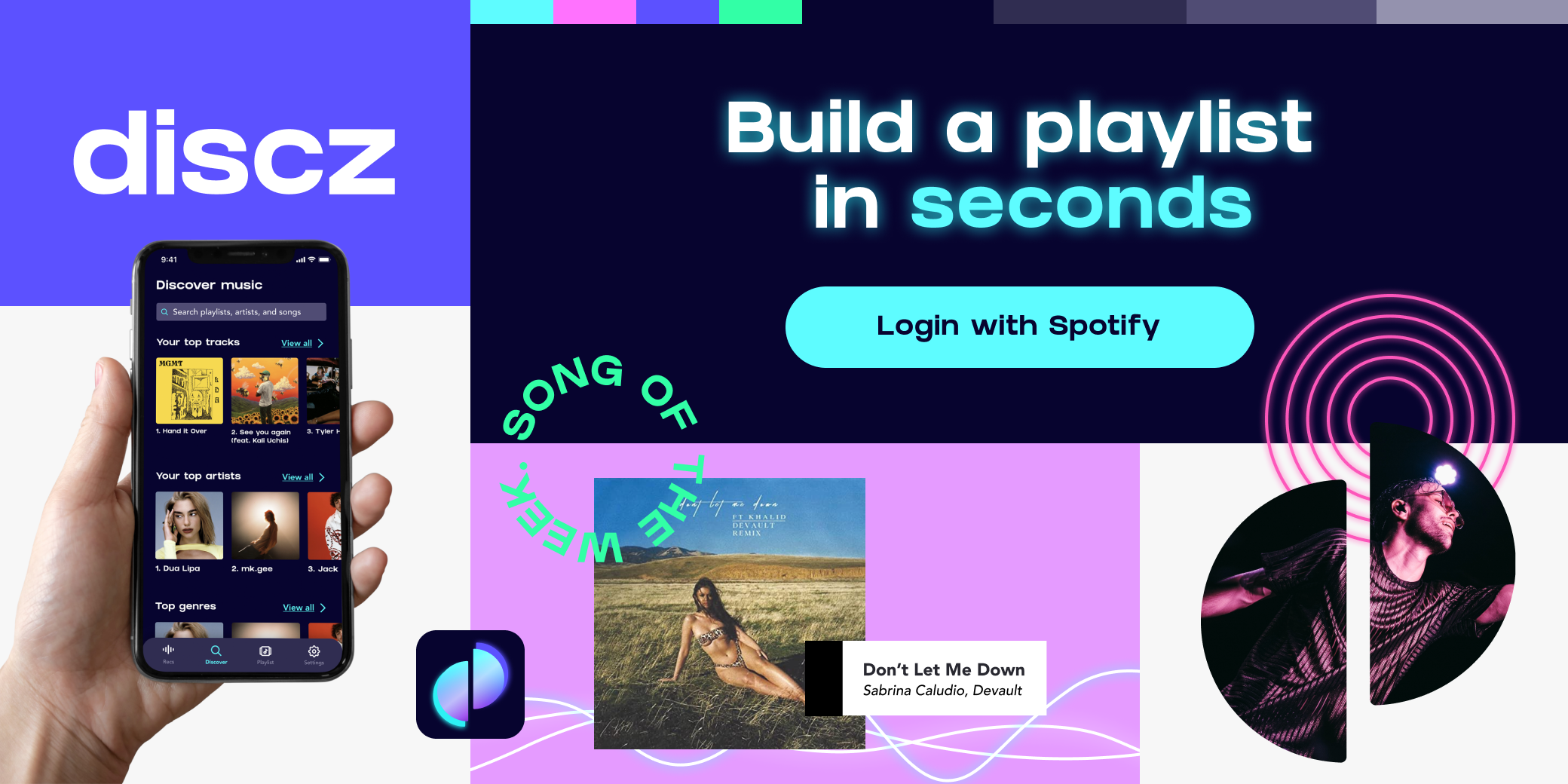
- Design App Store promotional images to officially publish Discz to the App Store.
- Design a deck for the Discz team to use while fundraising.
The design direction.
The Discz team wanted a young, electric feel that would cater to their Gen Z audience. For the design direction, I chose purple tones as background colors to mimic the hazy, bluish tones of EDM clubs. This paired well with bright neon blues and pinks, with a glow of those same colors, to create a neon light effect for many of the elements on the Discz app.
The logo was inspired by the OG CD disc, I wanted to take apart its shape and create a logo with a distinctive and recognizable icon. I found the separated discs to be recognizable at any size and an homage to discs themselves. For the primary logo, I added glows behind each of the separated discs to bring more of a neon light to the logo. I also added a gradient as a nod to the holographic CD disc glare.
For the fonts, we chose a big, chunky primary font that was bold and loud (like Gen Z), with a simpler sans serif as a secondary font. I also created a “vinyl disc” texture to use to supplement other graphic or UI elements.
The impact.
Discz has had tremendous growth in a small amount of time after its launch, reaching #1 in the music charts in the UK, Germany, and the Netherlands; and #12 in the US music charts. Only 6 months after its launch Discz has:
- 200,000 active users
- 135,000 monthly active users
- 55,000 weekly active users
- 8 million songs saved through Discz
- 5,000 new Spotify users created through Discz
- 10,000 App Store reviews