Overview.
Duration: September 2018 - May 2019
Tools + skills: Figma, user research interviews, wireframing, prototyping, playtesting, and UI design
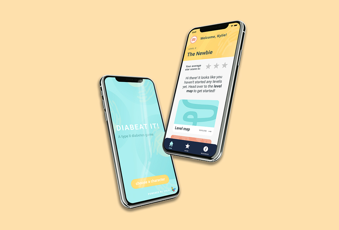
About the organization: Diabeat It! is an educational mobile app that uses short animated videos, interactive games and levels, and quizzes to teach and inform about Type II Diabetes. Each level explains a different aspect of Type II Diabetes. This project was created as a senior thesis project at the University of Southern California’s School of Cinematic Arts in conjunction with a group of doctors at the Children’s Hospital of Los Angeles and the USC Michelson Center’s Bridge Institute.
My role.
For this project, I was the lead UI designer designing the look and feel of the app, illustrations, and all of the screens. I was working in a small team of four—a developer, a designer/developer (whose thesis project this was), and a Diabetes student researcher—alongside doctors at the CHLA to create this app from start to finish. I worked to create questions for user interviews, prototypes for playtesting, starter copy for the app and informational videos, and finalized pixel-perfect screens and assets.
The problem.
Diabetes education for children is more often than not a long Powerpoint presentation filled with difficult-to-understand medical terms and does not make a large impact with its audience. Most Los Angeles patients with Type II Diabetes were of lower income communities and had lower education levels. We aimed to make Diabetes education:
- Understandable — We wanted to break down how Type II Diabetes works, how insulin works in diabetic patients, and how healthy lifestyle choices can positively affect people with Type II Diabetes.
- Engaging — We did not want this to be just another Powerpoint! We wanted the app to be fun, informative, and gamified, so that patients could continue using and learning from the app.
- Mature...ish — While most patients were 13-18, most had 4th to 6th grade reading levels, according to doctors at the Children’s Hospital of Los Angeles. We wanted the app to be understandable for someone who read at those levels, but also not be too childish or condescedning. Toeing the line between friendly and clear, and juvenile and patronizing, was a delicate process.
The solution.
For the app, we took a three-pronged approach to educate patients on Type II Diabetes:
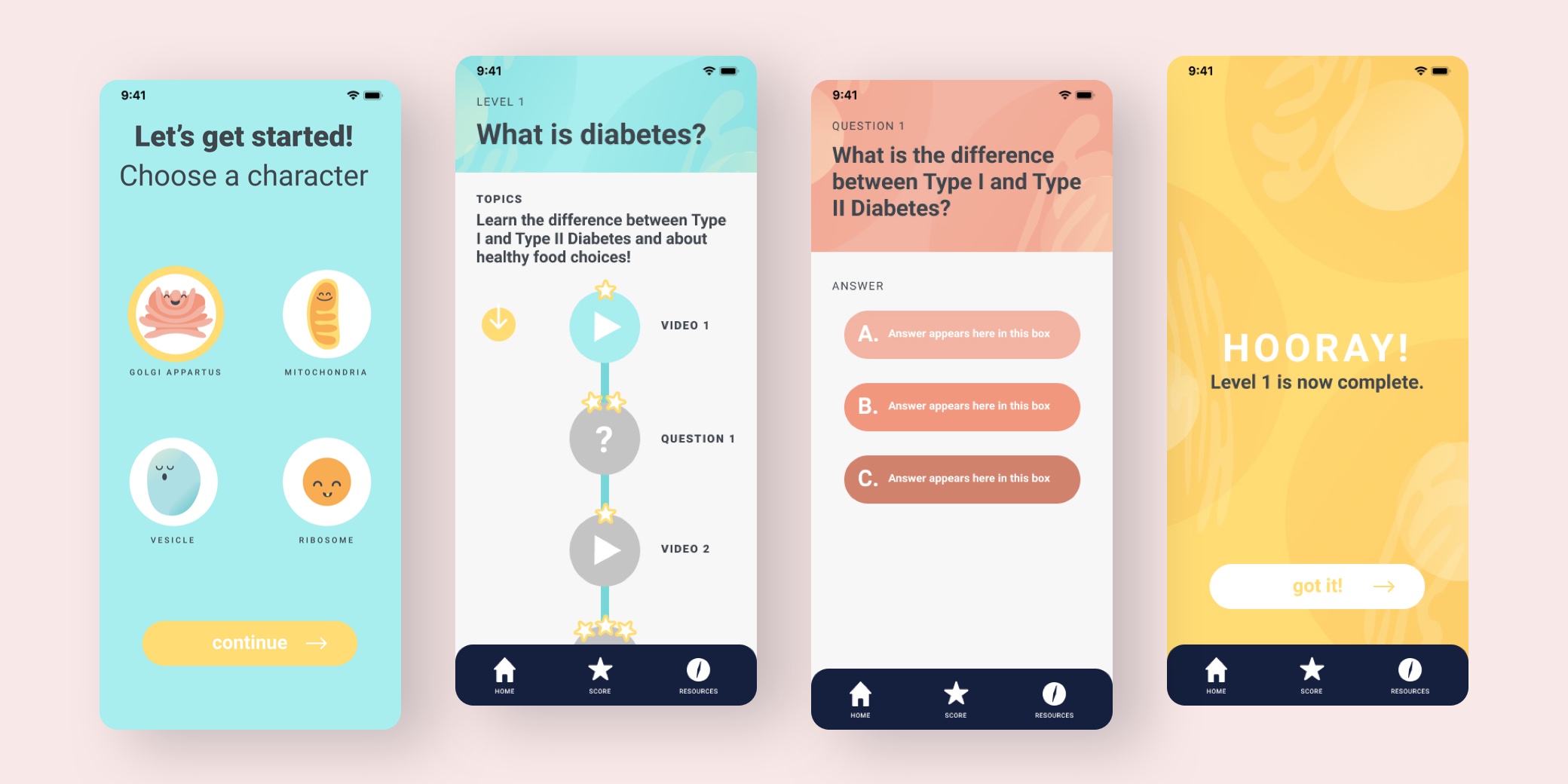
- Short informational videos — We wanted to make the information more digestible by creating short animated videos that use metaphors to explain the scientific processes. For example, when explaining insulin and its relationship to food consumption, we used a metaphor of a lock and a key. Each cell has a specific lock and insulin acts as a key to the cell, opening it up for glucose to enter. We kept the videos to a maximum of 1:30 to account for short attention spans.
- Questions to reinforce — To test the retention of knowledge, we added short questions quizzing users after each short video. The questions would be multiple choice and directly address key points learned in the prevous informational video.
- Interactive games — At the end of each level users can play a short, interactive game that would further reinforce the concepts taught at that level. This is a fun and interactive way to re-learn topics and really get a good understanding of them.
The design direction.
I wanted the look and feel of the app to be friendly, inviting, modern, and medicine-related. One of the biggest challenges when designing this app was creating a UI that was both simple and friendly, but not too childlike. We didn’t want our teenage users, who primarily read at 4th grade reading levels, to feel as if we were treating them like children. So we looked to Headspace for inspiration, as they bridge the gap between goofy and grown-up with their friendly monster characters and modern color scheme.
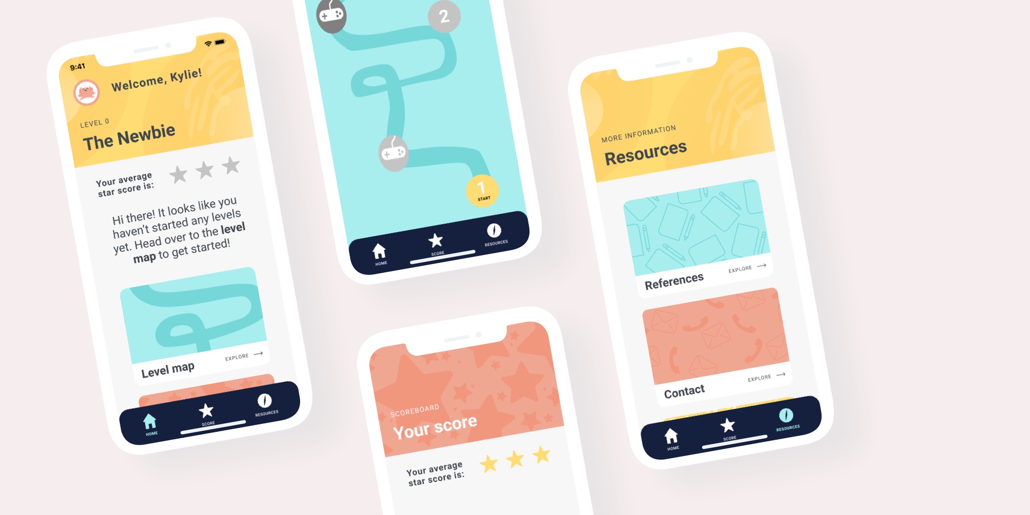
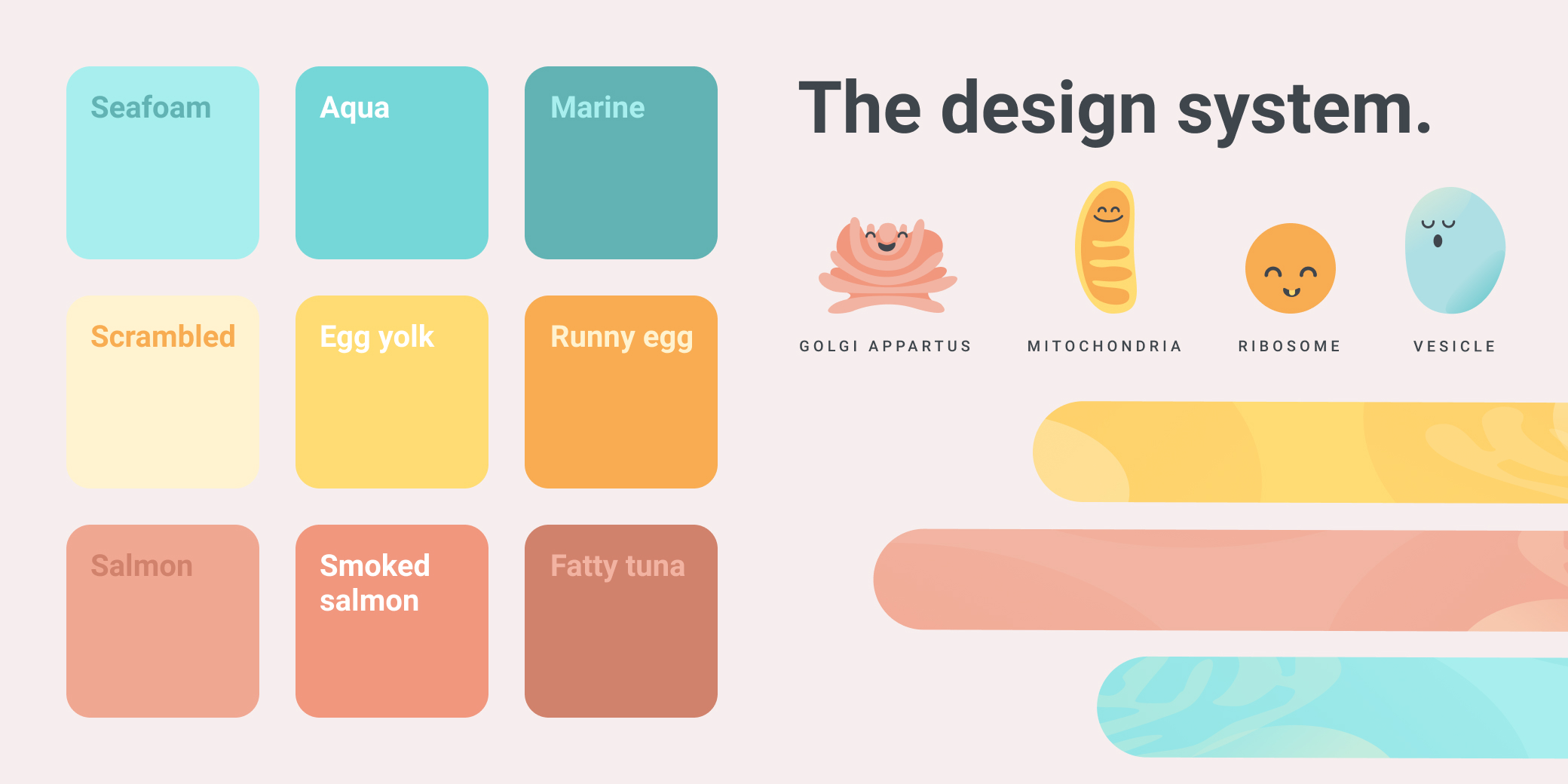
I still wanted the app to feel “scientific” and “medical” despite looking friendly, so I designed opaque cell structures as backgrounds and headers for each screen. I also created avatars that were parts of the cell (golgi apparatus, mitochondria, ribosome, and a vesicle) in a similar “cute” style to Headspace. Users would choose one of the four avatars when setting up the app.
For the colors, I wanted them to be harmonious and bright, but still modern and serious, so I opted for various shades of aqua, salmon, and yellow. Each color has 3 different shades for differentiation throughout the app.
The impact.
This project was presented as a senior thesis project for Kaleidoscope: Refocusing the Digital Spectacle at the University of Southern California’s School of Cinematic Arts.
Diabeat It! was awarded funding from USC’s Diabetes and Obesity Research Institute and also won the first place prize at the 2019 Undergraduate Symposium for Scholarly and Creative Work.